In this tutorial I will share how I create popup Javascript with HTML and CSS.
Popups are probably one of the most used UI elements in Web Design since the dawn of the internet.
That is why know how to build them is a very important skill for a web designer and front end web developer.
And thanks to wide CSS possibilities there are many creative ways to make a popup window or modal dialog today.
As a UI designer I decided to use a Glassmorphism UI style 😍 for this project.
So, let’s go and see the project in action below ⬇️
Project: Popup Javascript (Modal Dialog Window)
// how to create popup javascript
See the Pen Popup Modal Javascript by jsSecrets (@jssecrets) on CodePen.
Table of Contents

Basic Working Principle
// how to create popup javascript
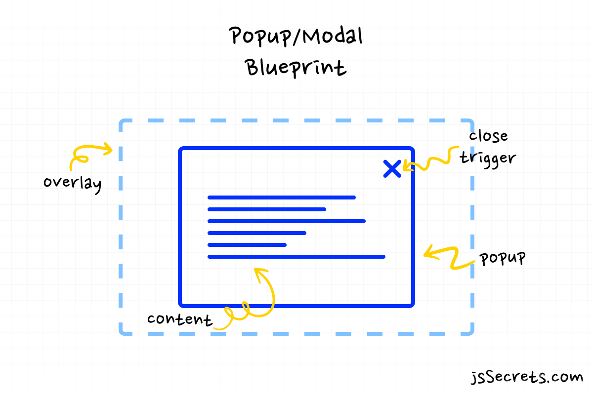
What is a popup / modal in a nutshell?
// how to create popup javascript
Usually, the modal window consists of three parts.
1️⃣ Window
A modal window may contain the following elements: plain text, images, form with fields, video, or almost any kind of HTML element or data type.
2️⃣ Underlay (like overlay, but under or below the window)
Usually, it can be black or white with a transparency or blur effect. But sometimes it can be fully transparent (invisible).
Underlay is an essential part of a modal/popup window as when it is invoked, a user mustn’t interact with other elements on the page.
3️⃣ Close/Exit mechanism
The user must have a way to close the window. For example, it could be a simple close button.
Working Principle
// how to create popup javascript
Usually, a popup window appears when the user clicks a button or some other event triggers it, for instance, a timer.
So, by default our two objects: the popup window and underlay are hidden (not visible) by default.
And when the target event takes place both of them have to change their state to visible.
Simplest Working Version (SWV)
In the web design, the simplest working version would be that the popup window and underlay have a display: none property by default and after event triggers are a state changes to display: block.
If you grasp the basic working principle – that’s it – the job is done! ✅
As everything else is just to make it make fancy 😎
Core concept
// how to create popup javascript
Let’s continue with the core concept of how the popup window that I built works.
1️⃣ HTML
I have three main elements in the markup:
.popup – the modal window with the content.
.overlay – the overlay (aka underlay)
.popup-btn – trigger button
2️⃣ CSS
.popup and .overlay are hidden by default.
When .popup-btn is triggered .popup gets the .show class and ?show? starts 🙂
.popup and .overlay become visible.
3️⃣ Javascript
Super easy 😉
When .popup-btn is triggered .popup gets the .show class and when the close “OK” button is clicked the .show class is removed.
Code explanation
// how to create popup javascript
If you have understood the core concept of how to create popup Javascript, the code will be easy to grasp.
HTML
// form popup javascript
<body>

<!--popup window-->
  <div class="popup">

<!--content of the popup window-->
      <div class="content">
        <div class="img-container">
          <img src="img/popup.png" />
        </div>
        <h1 class="title-text">What is Popup?</h1>
        <h2 class="paragraph-text">
          A pop-up is a small window that appears while browsing a website.
          Marketers mainly use pop-ups for advertising and generating leads.
        </h2>
        <div class="btn-container">
          <a class="btn">OK</a>
        </div>
      </div>
    </div>

<!--overlay-->
    <div class="overlay"></div>

<!--trigger button-->
    <div class="popup-btn">
      <img src="img/popup.png" />
    </div>

</body>
CSS
// form popup javascript
/* basic reset */
*,
::before,
::after {
  margin: 0;
  padding: 0;
  box-sizing: border-box;
  font-family: "Poppins", sans-serif;
}

ul {
  list-style: none;
}

h1 {
  font-size: 24px;
  font-weight: 900;
}

h2 {
  font-size: 16px;
  font-weight: 500;
}

.btn {
  padding: 16px 32px;
  font-size: 1em;
  border: none;
  outline: none;
  cursor: pointer;
  text-align: center;
  border-radius: 9px;
  position: relative;
  transition: all 0.2s linear;
}

body {
  height: 100vh;
  background: radial-gradient(circle, rgb(255, 255, 255) 70%, rgb(243, 243, 243) 100%);
  position: relative;
  display: flex;
  justify-content: center;
  align-items: center;
  overflow: hidden;
  color: #292d34;
}

.popup-btn {
  width: 160px;
  height: 160px;
  background: white;
  border-radius: 100%;
  box-shadow: 0 10px 25px rgba(124, 130, 141, 0.2);
  cursor: pointer;
  transition: all 0.25s ease-out;
  position: absolute;
  top: 50%;
  left: 50%;
  transform: translate(-50%, -50%);
  display: block;
}
.popup-btn:hover {
  transform: translate(-50%, calc(-50% - 5px));
}
.popup-btn img {
  max-width: 70%;
  position: absolute;
  top: 50%;
  left: 50%;
  transform: translate(-50%, -50%);
}

.overlay {
  position: fixed;
  z-index: 1000;
  width: 100%;
  height: 100%;
  top: 0;
  left: 0;
  background: rgba(255, 255, 255, 0.5);
  transition: all 1s;

/* overlay is hidden by default */
/* I don't use "display:none" as it is harder to animate */
  opacity: 0;
  visibility: hidden;
}

.popup {
  position: fixed;
  top: 50%;
  left: 50%;
  width: 50%;
  height: auto;
  max-width: 630px;
  min-width: 320px;
  z-index: 2000;
  transform: translateX(-50%) translateY(-50%);

/* popup is hidden by default */
  visibility: hidden;

/* I use two properties below as I have rotation in 3D */
  backface-visibility: hidden;
  perspective: 1300px;
}

.popup .content {
  padding: 24px;
  border-radius: 9px;
  box-shadow: 0 10px 25px rgba(124, 130, 141, 0.2);
  transition: all 0.7s;

/* ".content block is hidden by default" */
/* and also it is rotated at -70 degrees */
/* at the revelation moment it will rotate to 0 degrees */
  transform: rotateX(-70deg);
  opacity: 0;

  transform-style: preserve-3d;

/* Glassmorphism styles */
  background: rgba(255, 255, 255, 0.55);
  backdrop-filter: blur(4.5px);
  -webkit-backdrop-filter: blur(4.5px);
  border: 1px solid rgba(255, 255, 255, 0.18);
}
.popup .content .img-container {
  text-align: center;
  margin-bottom: 16px;
}
.popup .content .img-container img {
  max-width: 140px;
  vertical-align: middle;
}
.popup .content .title-text {
  text-align: center;
  margin-bottom: 16px;
}
.popup .content .paragraph-text {
  width: 70%;
  margin-left: auto;
  margin-right: auto;
  margin-bottom: 48px;
  color: #7c828d;
}
.popup .content .btn-container {
  text-align: center;
}
.popup .content .btn-container .btn {
  background: #b9bec7;
  color: white;
  box-shadow: 0 10px 25px rgba(124, 130, 141, 0.2);
  transition: all 0.9s ease;
}
.popup .content .btn-container .btn:hover {
  background: #7c828d;
}

/* Modal Window Revelation */

/* Pay attention that .popup only becomes visible */
/* no animations here! */
.popup.show {
  visibility: visible;
}

/* pay attention to the selectors logic */
/* I used general sibling combinator here */
/* not the child or descendant selector */
/* as there are version using them */
.popup.show ~ .overlay {
  opacity: 1;
  visibility: visible;
}

/* read it like this: */
/* as soon as .popup gets the .show class */
/* reveal the .content i.e. make it visible and rotate to 0 degrees */
/* and as the .content has a "transition: all 0.7s" */
/* animation will take place */
.popup.show .content {
  transform: rotateX(0deg);
  opacity: 1;
}

.popup.show ~ .popup-btn {
  display: none;
}
Javascript
// form popup javascript
Everything is straightforward in JS code ?
// Variables

const popupTrigger = document.querySelector('.popup-btn');
const popup = document.querySelector('.popup');
const closeBtn = document.querySelector('.btn');

// Functions

const showPopup = () => {
  popup.classList.add('show');
};

const hidePopup = () => {
  popup.classList.remove('show');
};

// Event Listeners

popupTrigger.addEventListener('click', showPopup);
closeBtn.addEventListener('click', hidePopup);
Project Ideas
// form popup javascript
1️⃣ You can try different CSS effects for popup window animation. There are numerous examples here.
2️⃣ Try to add different HTML elements to the modal window. It can be video, image gallery, long text content, or form elements.
3️⃣ Image gallery functionality. Let’s say there is an image grid on the page and when the user clicks on the image it pops up in the modal window scaled up.
What to do next?
You can check out my similar UI projects:
3️⃣ Javascript Multi Level Menu
Resources
// form popup javascript
1️⃣ jssecrets.com
2️⃣ Online illustrations by Storyset
3️⃣ Online illustrations by Storyset

I really like looking through an article that can make men and women think.
Also, thanks for allowing for mee to comment!
haha))
Who knows?! Maybe soon enough you’ll have something like that.
AI already does some cool stuff.