In this tutorial I will share how I built dynamic Javascript accordion with CSS and Javascript.
As a UI designer I decided to use a modern minimalistic UI style for this project. And I also made the accordion a dynamic height only using one line of CSS. 😊
So, let’s go and see the project in action below ⬇️
Project: Javascript accordion
// how to create accordion using javascript
See the Pen Accordion Javascript by jsSecrets (@jssecrets) on CodePen.
I designed a nice modern UI with good looking colors and shadow. Additionally I have added CSS transitions to make tabs opening and closing effect smoother.
Table of Contents
Basic Working Principle
What is Javascript Accordion in a nutshell?
Let’s say we have 10+ questions FAQ section on our web page.
Page usually structured like this:
[Question-1 – Answer-1], [Question-2 – Answer-2] … [Question-N – Answer-N].
Content could become very loooooong 😱
and that’s when ⤵️
Accordion comes to rescue 🤟
Its structure helps to display a long content in a very compact way. A content is hidden by default and can be seen only when user opens it.
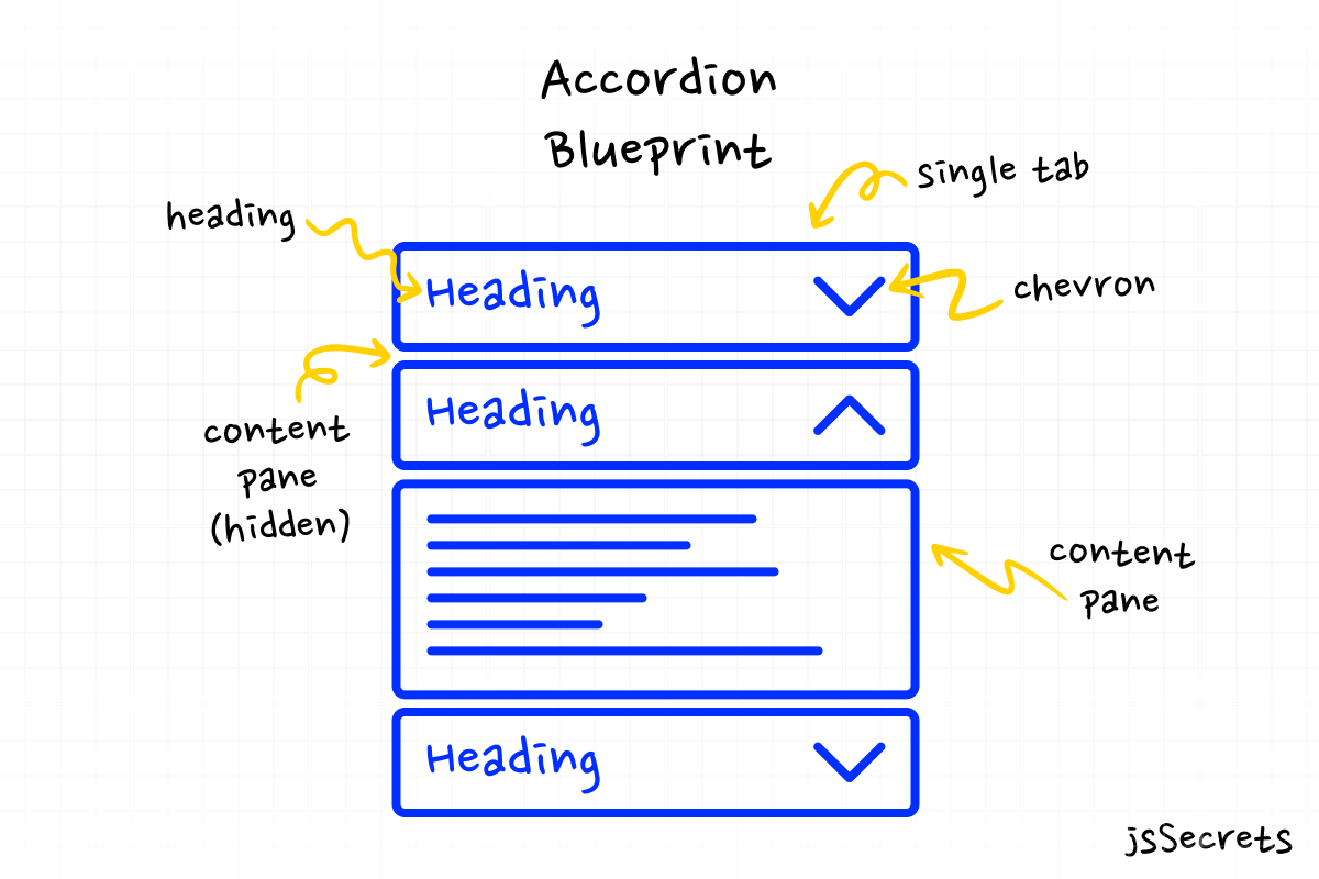
Accordion consists of tabs.
Each tab consists of:
1️⃣ Heading
For example it could be a question in FAQ.
2️⃣ Content pane
Usually it is a text content, for instance an answer for a question.
But it could be any type of content: video, some widget, etc..
How it works?
By default all content panes are hidden. And all headings are visible all the time.
When user clicks on the heading the corresponding pane opens. If user to click again on the heading the content pane will disappear.
Sometimes accordion is built in a way that only one content pane may be visible.
Working Principle
Simplest Working Version (SWV)
It will look something like this:
We define a parent container for the whole component – .accordion.
Next define single tab with and its two children: tab name (heading) and tab content (content pane).
Then add as much tabs as needed.
Set all content panes to display:none.
Add a CSS class with display:block for visible state.
Lastly create a JS function to toggle between visible and hidden states.
Core concept
// javascript accordion examples
Let’s continue with core concept of how JS accordion works.
1️⃣ HTML
The accordion’s markup is straight forward.
I have a main <div class="accordion"> and number of child elements <div class="tab">.
Each <div class="tab"> has two children <div class="tab-name"> and <div class="tab-content">.
2️⃣ CSS
All CSS is just a basic styling.
I also use CSS animations to create sliding effect.
3️⃣ Javascript
JS for accordion menu is very short and simple.
The only thing I do is class toggling.
That is it 😎
Code explanation
// javascript accordion tutorial
If you have understood the core concept of how the Javascript accordion was built, the code will be easy to grasp.
HTML
// javascript accordion with arrow
<body>

<!--Very simple-->
<!--every <.tab> contains <.tab-name>, chevron <svg> and <.tab-content> -->

<div class="accordion">
      <div class="tab">
        <div class="tab-name">
          UI Secrets
          <svg
            class="chevron-icon"
            width="26"
            height="13"
            viewBox="0 0 26 13"
            fill="none"
            xmlns="http://www.w3.org/2000/svg"
          >
            <path
              fill-rule="evenodd"
              clip-rule="evenodd"
              d="M1.06414 1.06414C1.35704 0.771251 1.83191 0.771251 2.1248 1.06414L11.2676 10.2069C11.6724 10.6117 11.9445 10.883 12.1708 11.0751C12.3904 11.2615 12.5171 11.329 12.6137 11.3604C12.8648 11.442 13.1352 11.442 13.3863 11.3604C13.4829 11.329 13.6096 11.2615 13.8292 11.0751C14.0556 10.883 14.3276 10.6117 14.7324 10.2069L23.8752 1.06414C24.1681 0.771251 24.643 0.771251 24.9359 1.06414C25.2287 1.35704 25.2287 1.83191 24.9359 2.1248L15.7931 11.2676L15.7715 11.2892C15.3938 11.6668 15.0786 11.9821 14.8 12.2186C14.5094 12.4653 14.2098 12.67 13.8498 12.787C13.2975 12.9664 12.7025 12.9664 12.1502 12.787C11.7902 12.67 11.4906 12.4653 11.2 12.2186C10.9214 11.9821 10.6061 11.6668 10.2285 11.2891L10.2069 11.2676L1.06414 2.1248C0.771251 1.83191 0.771251 1.35704 1.06414 1.06414Z"
            />
          </svg>
        </div>
        <div class="tab-content">
          Lorem ipsum, dolor sit amet consectetur adipisicing elit. Laudantium
          dolorem iure similique modi sequi asperiores.
        </div>
      </div>
      <div class="tab">
        <div class="tab-name">
          HTML Secrets
          <svg
            class="chevron-icon"
            width="26"
            height="13"
            viewBox="0 0 26 13"
            fill="none"
            xmlns="http://www.w3.org/2000/svg"
          >
            <path
              fill-rule="evenodd"
              clip-rule="evenodd"
              d="M1.06414 1.06414C1.35704 0.771251 1.83191 0.771251 2.1248 1.06414L11.2676 10.2069C11.6724 10.6117 11.9445 10.883 12.1708 11.0751C12.3904 11.2615 12.5171 11.329 12.6137 11.3604C12.8648 11.442 13.1352 11.442 13.3863 11.3604C13.4829 11.329 13.6096 11.2615 13.8292 11.0751C14.0556 10.883 14.3276 10.6117 14.7324 10.2069L23.8752 1.06414C24.1681 0.771251 24.643 0.771251 24.9359 1.06414C25.2287 1.35704 25.2287 1.83191 24.9359 2.1248L15.7931 11.2676L15.7715 11.2892C15.3938 11.6668 15.0786 11.9821 14.8 12.2186C14.5094 12.4653 14.2098 12.67 13.8498 12.787C13.2975 12.9664 12.7025 12.9664 12.1502 12.787C11.7902 12.67 11.4906 12.4653 11.2 12.2186C10.9214 11.9821 10.6061 11.6668 10.2285 11.2891L10.2069 11.2676L1.06414 2.1248C0.771251 1.83191 0.771251 1.35704 1.06414 1.06414Z"
            />
          </svg>
        </div>
        <div class="tab-content">
          Lorem ipsum dolor, sit amet consectetur adipisicing elit. Libero saepe
          cupiditate porro repellat magnam qui eos quos sunt, ratione dicta.
          Lorem ipsum dolor, sit amet consectetur adipisicing elit. Placeat amet
          quidem alias.
        </div>
      </div>
      <div class="tab">
        <div class="tab-name">
          CSS Secrets
          <svg
            class="chevron-icon"
            width="26"
            height="13"
            viewBox="0 0 26 13"
            fill="none"
            xmlns="http://www.w3.org/2000/svg"
          >
            <path
              fill-rule="evenodd"
              clip-rule="evenodd"
              d="M1.06414 1.06414C1.35704 0.771251 1.83191 0.771251 2.1248 1.06414L11.2676 10.2069C11.6724 10.6117 11.9445 10.883 12.1708 11.0751C12.3904 11.2615 12.5171 11.329 12.6137 11.3604C12.8648 11.442 13.1352 11.442 13.3863 11.3604C13.4829 11.329 13.6096 11.2615 13.8292 11.0751C14.0556 10.883 14.3276 10.6117 14.7324 10.2069L23.8752 1.06414C24.1681 0.771251 24.643 0.771251 24.9359 1.06414C25.2287 1.35704 25.2287 1.83191 24.9359 2.1248L15.7931 11.2676L15.7715 11.2892C15.3938 11.6668 15.0786 11.9821 14.8 12.2186C14.5094 12.4653 14.2098 12.67 13.8498 12.787C13.2975 12.9664 12.7025 12.9664 12.1502 12.787C11.7902 12.67 11.4906 12.4653 11.2 12.2186C10.9214 11.9821 10.6061 11.6668 10.2285 11.2891L10.2069 11.2676L1.06414 2.1248C0.771251 1.83191 0.771251 1.35704 1.06414 1.06414Z"
            />
          </svg>
        </div>
        <div class="tab-content">
          Lorem, ipsum dolor sit amet consectetur adipisicing elit.
        </div>
      </div>
      <div class="tab">
        <div class="tab-name">
          JS Secrets
          <svg
            class="chevron-icon"
            width="26"
            height="13"
            viewBox="0 0 26 13"
            fill="none"
            xmlns="http://www.w3.org/2000/svg"
          >
            <path
              fill-rule="evenodd"
              clip-rule="evenodd"
              d="M1.06414 1.06414C1.35704 0.771251 1.83191 0.771251 2.1248 1.06414L11.2676 10.2069C11.6724 10.6117 11.9445 10.883 12.1708 11.0751C12.3904 11.2615 12.5171 11.329 12.6137 11.3604C12.8648 11.442 13.1352 11.442 13.3863 11.3604C13.4829 11.329 13.6096 11.2615 13.8292 11.0751C14.0556 10.883 14.3276 10.6117 14.7324 10.2069L23.8752 1.06414C24.1681 0.771251 24.643 0.771251 24.9359 1.06414C25.2287 1.35704 25.2287 1.83191 24.9359 2.1248L15.7931 11.2676L15.7715 11.2892C15.3938 11.6668 15.0786 11.9821 14.8 12.2186C14.5094 12.4653 14.2098 12.67 13.8498 12.787C13.2975 12.9664 12.7025 12.9664 12.1502 12.787C11.7902 12.67 11.4906 12.4653 11.2 12.2186C10.9214 11.9821 10.6061 11.6668 10.2285 11.2891L10.2069 11.2676L1.06414 2.1248C0.771251 1.83191 0.771251 1.35704 1.06414 1.06414Z"
            />
          </svg>
        </div>
        <div class="tab-content">
          Lorem ipsum dolor sit amet consectetur adipisicing elit. Recusandae
          pariatur cumque similique nemo ipsum tempora dolorem id ipsa! Cumque,
          sint?
        </div>
      </div>
    </div>

</body>
CSS
// javascript accordion js
/*basic reset*/

*,
::before,
::after {
  margin: 0;
  padding: 0;
  box-sizing: border-box;
  font-family: "Urbanist", sans-serif;
}

body {
  height: 100vh;
  background: radial-gradient(circle, rgb(255, 255, 255) 70%, rgb(243, 243, 243) 100%);
  position: relative;
}

.accordion {
  width: 300px;
  padding: 24px;
  border-radius: 8px;
  background: white;
  box-shadow: 0 10px 25px rgba(124, 130, 141, 0.2);
  position: relative;
  transform-style: preserve-3d;
  margin-left: auto;
  margin-right: auto;
  margin-top: 120px;
}


/* decorative frame */

.accordion::after {
  content: "";
  width: 100%;
  height: 100%;
  background: linear-gradient(white, white) padding-box, linear-gradient(135deg, rgb(123, 104, 238) 0%, rgb(235, 61, 174) 33%, rgb(247, 206, 81) 66%, rgb(91, 197, 250) 100%) border-box;
  border: 2px dashed transparent;
  border-radius: 8px;
  position: absolute;
  top: 0px;
  left: 0px;
  transform: translateZ(-10px) rotate(5deg);
}


.accordion .tab {
  cursor: pointer;
}
.accordion .tab:not(:last-child) {
  margin-bottom: 8px;
}
.accordion .tab-name {
  font-size: 24px;
  font-weight: 700;
  margin-bottom: 16px;
  color: #292d34;
  position: relative;
  user-select: none;
  padding: 10px;
  border-radius: 8px;
  transition: all 0.5s ease;
}
.accordion .tab-name .chevron-icon {
  fill: #292d34;
  position: absolute;
  left: calc(100% - 10px);
  top: 50%;
  transform: translate(-100%, -50%);
  transition: all 0.5s ease;
}
.accordion .tab-content {
  user-select: none;
  color: #7c828d;
  max-height: 0;
  overflow: hidden;
  padding: 10px;
  font-size: 16px;
  border-radius: 9px;
  transition: all 0.5s linear;
  animation: slideDownReverse 0.25s ease forwards;
}
.accordion .tab.active .tab-name {
  color: white;
}


.accordion .tab.active .tab-content {
  color: white;

/* max-height: VALUE; is manual value that I've entered  */
/* You can basically enter any relatively big value (ex: 9999px) */
/* The beauty is that tab will be opened only to the height of the content */
/* if your content is two lines it will be opened for two lines height */
/* if it's ten then for ten lines height */

  max-height: 300px; /* enter your value */
  animation: slideDown 1s ease-out forwards;
}
.accordion .tab.active .chevron-icon {
  transform: translate(-100%, -50%) rotate(180deg);
  fill: white;
}
.accordion .tab:nth-of-type(1).active .tab-name {
  background: linear-gradient(45deg, rgb(123, 66, 209) 0%, rgb(123, 104, 238) 100%);
  box-shadow: 0 10px 25px rgba(123, 66, 209, 0.4);
}
.accordion .tab:nth-of-type(1).active .tab-content {
  background: linear-gradient(45deg, rgb(123, 66, 209) 0%, rgb(123, 104, 238) 100%);
  box-shadow: 0 10px 25px rgba(123, 66, 209, 0.4);
}
.accordion .tab:nth-of-type(2).active .tab-name {
  background: linear-gradient(45deg, rgb(245, 205, 81) 0%, rgb(247, 206, 81) 100%);
  box-shadow: 0 10px 25px rgba(245, 205, 81, 0.4);
}
.accordion .tab:nth-of-type(2).active .tab-content {
  background: linear-gradient(45deg, rgb(245, 205, 81) 0%, rgb(247, 206, 81) 100%);
  box-shadow: 0 10px 25px rgba(245, 205, 81, 0.4);
}
.accordion .tab:nth-of-type(3).active .tab-name {
  background: linear-gradient(45deg, rgb(222, 23, 152) 0%, rgb(235, 61, 174) 100%);
  box-shadow: 0 10px 25px rgba(222, 23, 152, 0.4);
}
.accordion .tab:nth-of-type(3).active .tab-content {
  background: linear-gradient(45deg, rgb(222, 23, 152) 0%, rgb(235, 61, 174) 100%);
  box-shadow: 0 10px 25px rgba(222, 23, 152, 0.4);
}
.accordion .tab:nth-of-type(4).active .tab-name {
  background: linear-gradient(45deg, rgb(42, 179, 248) 0%, rgb(91, 197, 250) 100%);
  box-shadow: 0 10px 25px rgba(42, 179, 248, 0.4);
}
.accordion .tab:nth-of-type(4).active .tab-content {
  background: linear-gradient(45deg, rgb(42, 179, 248) 0%, rgb(91, 197, 250) 100%);
  box-shadow: 0 10px 25px rgba(42, 179, 248, 0.4);
}

/* CSS animations for smooth accordion opening/closing transition */

@keyframes slideDown {
  from {
    opacity: 0;
    transform: translateY(-20px);
  }
  to {
    opacity: 1;
    transform: translateY(0px);
  }
}
@keyframes slideDownReverse {
  from {
    opacity: 1;
    transform: translateY(0px);
  }
  to {
    opacity: 0;
    transform: translateY(-40px);
  }
}
Javascript
// pure javascript accordion
// Variables
const tabs = document.querySelectorAll('.tab');

// Functions

// I use "event" argument, as there are multiple tabs
// "event.currentTarget" means - do operations
//  with element that the event listener is attached to
// in our case we attached to event listener all ".tab"
// it is a JS coding technique when working with
// multiple elements of the same tag or class

const toggleTab = (event) => {
  event.currentTarget.classList.toggle('active');
};

// Event Listeners

// loop thru all tabs

tabs.forEach((tab) => {
  tab.addEventListener('click', toggleTab);
});
Project Ideas
// plain javascript accordion
1️⃣ Horizontal Javascript accordion
2️⃣ Accordion where only one content pane can opened at the time
Frequently Asked Questions
// basic javascript accordion
1️⃣ What is a Javascript accordion?
Javascript accordion is UI element which used to display long pieces of a content in a compact way. It consists of tabs. Every tab has a title and a content. All the content is hidden by default. To see it user has to click a tab’s title and click again to hide a content.
2️⃣ How does Javascript accordion work?
Please see the answer above. ⬆️
3️⃣ How to close Javascript accordion?
In some cases a user has to click a tab’s title to open/close the content.
In other case JS accordion coded in way that only one content tab could be visible i.e. when a tab is clicked, an opened one will be closed.
What to do next?
You can check out my similar projects:
2️⃣ Javascript Multi Level Menu
Resources
// vanilla js accordion
1️⃣ jssecrets.com
2️⃣ Data illustrations by Storyset
3️⃣ User illustrations by Storyset