In this tutorial I will share how I built sliding tabs Javascript with HTML and CSS.
Tabs are one of the most used UI elements on the Web. That’s why it is essential to learn how to build it.
As a UI and Web designer, I decided to style sliding tabs in Glassmorphism UI style 😍 and add nice transitions.
So, let’s go and see the project in action below ⬇️
Project: Tabs Javascript (sliding tabs)
// sliding tabs javascript
See the Pen Tabs Javascript by jsSecrets (@jssecrets) on CodePen.
Table of Contents

Basic Working Principle
// sliding tabs javascript
What is Tabs in a nutshell?
// sliding tabs javascript
The Tabs element is a way to efficiently organize content on the page.
Tabs allow navigation between groups of content that are related and stay at the same level of hierarchy.
Tabs save vertical space.
Let’s say we have three products. Every product has a set of characteristics and descriptions. If we are to display them in a default way ( one by one in a vertical order ) they will take up a good chunk of a vertical space. But if we are to organize our three products in tabs we will save a considerable amount of space.
Usually, the Tabs element consists of two elements.
1️⃣ Navigation “link”
It’s a handle to navigate to the corresponding content.
2️⃣ Content panes
Container with content: text, images, video, audio, etc.
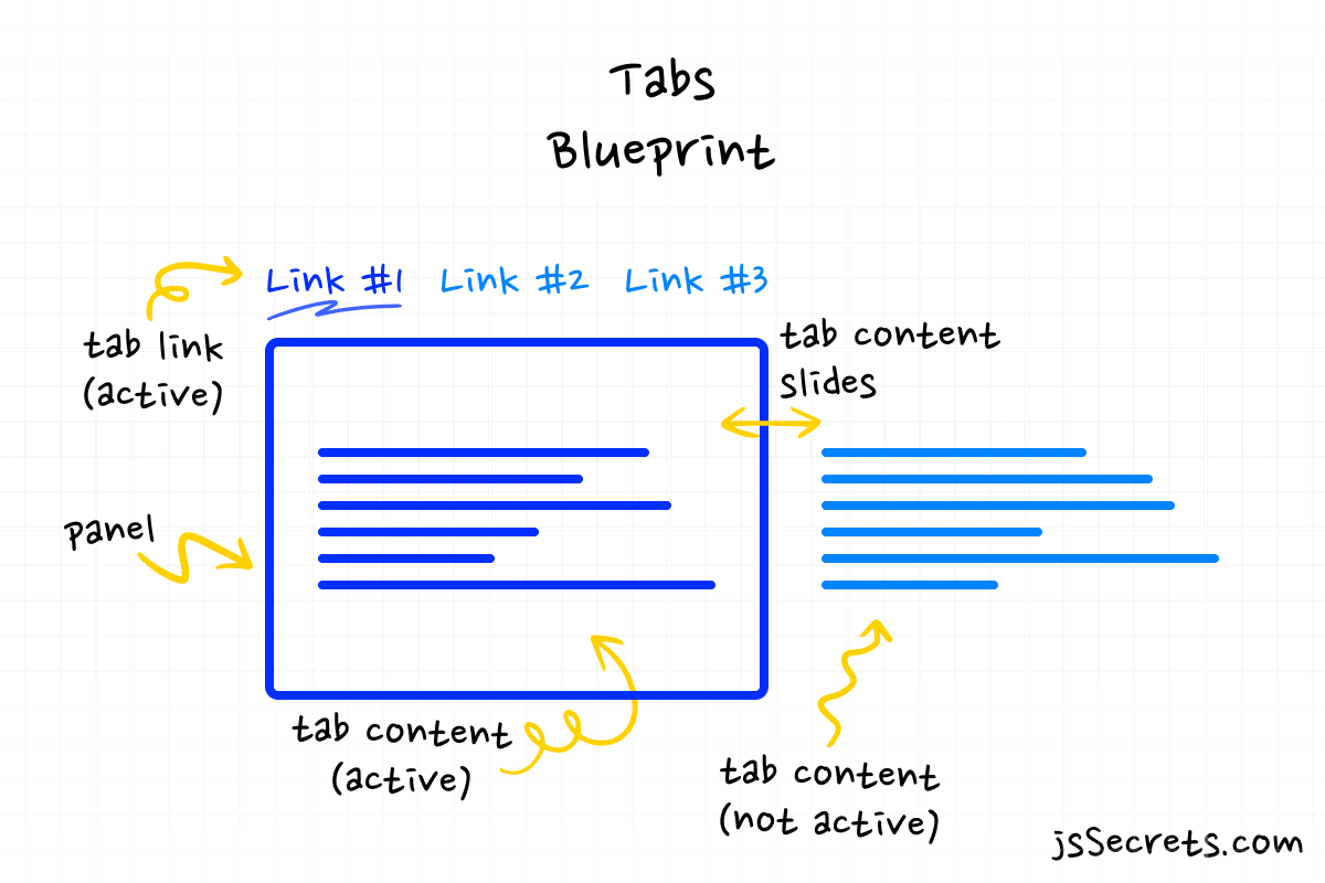
Working Principle
// sliding tabs javascript
Simplest Working Version (SWV)
The simplest working version would be to have two navigation links and two content panes.
Tab #1: Navigation link #1 and its content pane #1 are visible, i.e. have an active state. (ex: class tab.active)
When a user clicks on the other ( not active ) tab, the class .active is being removed from the currently active tab, and at the same time class .active is being set onto the clicked tab.
Core concept
// sliding tabs javascript
Let’s continue with a core concept of how the sliding tabs element works.
1️⃣ HTML
Take a look at the basic structure of website tabs example.
<!--basic markup structure of sliding tabs-->

   <!-- tabs -->

   <!-- container -->
      <ul class="tabs">


        <!-- single tab -->
        <!-- this one is active -->
        <!-- "data-panel="PANEL-INDEX"" it is linkage mechanism between link and panel -->
        <li class="tab active" data-panel="PANEL-INDEX">
          <span class="title">TITLE</span>
        </li>

        <!--single tab (not active)-->
        <li class="tab" data-panel="PANEL-INDEX">
          <span class="title">TITLE</span>
        </li>

       ...


        <!--sliding element-->
        <!--purely for decorative purposes-->
        <!--it is optional to use-->
        <div class="slider"></div>

      </ul>
<!--END tabs -->


     <!-- tab panels-->


     <!--container-->
      <div class="panels">

        <!--single panel-->
        <!--this one is active i.e. visible at the moment-->
        <div id="PANEL-INDEX" class="panel show">


          <!--content block-->
          <div class="content">
            <div class="content-img">
              <img src="img/btc.png" />
            </div>
            <div class="content-title">TITLE</div>
            <div class="content-paragraph">
             TEXT CONTENT
            </div>
          </div>
        </div>


        <!--single panel-->
        <!--this one is NOT active i.e. hidden at the moment-->
        <div id="PANEL-INDEX" class="panel">
          <div class="content">
            <div class="content-img">
              <img src="img/ltc.png" />
            </div>
            <div class="content-title">TITLE</div>
            <div class="content-paragraph">
              TEXT CONTENT
            </div>
          </div>
        </div>

       ...

      </div>
    </div>
    <!--END tab panels-->
2️⃣ CSS
We have three tabs horizontally aligned with flexbox.
And three panels corresponding to each tab. By default each panel is hidden. The active tab’s panel is visible.
Slider element is positioned absolute and controlled through left CSS property.
3️⃣ Javascript
When a user clicks on the tab ( not active ), class .active is removed from the currently active tab, and at the same time class .active is set onto the clicked tab. The same actions happen with panels.
Code explanation
// sliding tabs javascript
If you have understood the core concept of how to tabs are built, the code will be easy to grasp.
HTML
// sliding tabs javascript
<!--sliding tabs javascript -->

<body>


    <div class="tabs-component">

      <!-- tab titles -->
      <ul class="tabs">

<!--first tab-->
        <li class="tab active" data-panel="#one">
          <span class="title">Bitcoin</span>
        </li>


<!--second tab-->
        <li class="tab" data-panel="#two">
          <span class="title">Litecoin</span>
        </li>


<!--third tab-->
        <li class="tab" data-panel="#three">
          <span class="title">USD Coin</span>
        </li>


<!--slider element-->
        <div class="slider"></div>

      </ul>
      <!--END tab titles -->

      <!-- tab panels-->
      <div class="panels">

<!--first panel-->
<!--it has a class ".show", i.e. it's visible -->

  <!-- "id="one"" is connected to "data-panel="#one""  -->

        <div id="one" class="panel show">

          <div class="content">
            <div class="content-img">
              <img src="img/btc.png" />
            </div>
            <div class="content-title">Bitcoin</div>
            <div class="content-paragraph">
              Bitcoin is a decentralized digital currency, without a central
              bank or single administrator, that can be sent from user to user
              on the peer-to-peer bitcoin network without the need for
              intermediaries.
            </div>
          </div>
        </div>

<!--second panel-->
 <!-- "id="two"" is connected to "data-panel="#two""  -->

        <div id="two" class="panel">
          <div class="content">
            <div class="content-img">
              <img src="img/ltc.png" />
            </div>
            <div class="content-title">Litecoin</div>
            <div class="content-paragraph">
              Litecoin is a peer-to-peer cryptocurrency and open-source software
              project released under the MIT/X11 license. Litecoin was an early
              bitcoin spinoff or altcoin, starting in October 2011. Supply limit
              is 84,000,000 LTC
            </div>
          </div>
        </div>

<!--third panel-->
 <!-- "id="three"" is connected to "data-panel="#three""  -->

        <div id="three" class="panel">
          <div class="content">
            <div class="content-img">
              <img src="img/usd.png" />
            </div>
            <div class="content-title">USD Coin</div>
            <div class="content-paragraph">
              USD Coin is a digital stablecoin that is pegged to the United
              States dollar. USD Coin is managed by a consortium called Centre,
              which was founded by Circle including members from the Coinbase.
            </div>
          </div>
        </div>
      </div>
      <!--END tab panels-->

    </div>

</body>
CSS
// tabs javascript example
/*basic reset*/
*,
::before,
::after {
  margin: 0;
  padding: 0;
  box-sizing: border-box;
  font-family: "Poppins", sans-serif;
}

ul {
  list-style: none;
}

body {
  height: 100vh;
  background: radial-gradient(circle, rgb(255, 255, 255) 70%, rgb(243, 243, 243) 100%);
  position: relative;
  display: flex;
  justify-content: center;
  align-items: center;
  overflow: hidden;
  color: #292d34;
}


/*tabs component*/
.tabs-component {
  width: 320px;
}
@media (max-width: 575.9px) {
  .tabs-component {
    width: 300px;
  }
}

/*tabs occupy 100% width of a parent*/
.tabs-component .tabs {
  width: 100%;
  display: flex;
  justify-content: center;
  align-items: center;
  margin-bottom: 32px;
  position: relative;
}


/*single tab*/
.tabs-component .tabs .tab {

/* width is 33.33333% because we have 3 tabs */
/* 100%/3 = 33.33333% */

  width: 33.33333%;
  height: 100%;
  display: block;
  text-align: center;
  cursor: pointer;
  padding: 16px 0 16px 0;
  border-radius: 9px;
  font-size: 16px;
  z-index: 1;
  position: relative;
  color: #7c828d;
  transition: all 0.3s linear;
}
.tabs-component .tabs .tab:hover {
  color: #f7ce51;
}
.tabs-component .tabs .tab .title {
  font-size: 16px;
}
.tabs-component .tabs .tab.active .title {
  font-weight: 900;
  color: white;
}

/*slider*/
/*width is 33.333% is because there are three elements*/
/*100% / 3 = 33.333%*/

/*in general case, to calculate the width divide 100 by (number of tabs)*/
/*ex: 5 tabs - 100% / 5 = 20%*/

.tabs-component .tabs .slider {
  position: absolute;
  left: 0;
  bottom: 0;
  height: 100%;
  width: 33.3333%;
  background: linear-gradient(45deg, rgb(245, 205, 81) 0%, rgb(247, 206, 81) 100%);
  box-shadow: 0 10px 25px rgba(245, 205, 81, 0.4);
  border-radius: 9px;
  z-index: 0;
  transition: all 0.3s linear;
}

/*slider's position state*/

/*first tab is active*/
/*slider resides on 0*/
/*slider's width = 33.333%*/
/*0 + 33.333% = 33.333% i.e. covers the first tab*/

.tabs-component .tabs .tab:nth-of-type(1).active ~ .slider {
  left: 0;
}

/*second tab is active*/
/*slider resides on 33.333%*/
/*slider's width = 33.333%*/
/*33.333% + 33.333% = 66.666% i.e. covers the second tab*/

.tabs-component .tabs .tab:nth-of-type(2).active ~ .slider {
  left: 33.33333%;
}

/*third tab is active*/
/*slider resides on 66.666%*/
/*slider's width = 33.333%*/
/*66.666% + 33.333% = 100% i.e. covers the third tab*/

.tabs-component .tabs .tab:nth-of-type(3).active ~ .slider {
  left: 66.66666%;
}

/*single panel*/

.tabs-component .panels .panel {

/*hidden by default*/
  display: none;

  height: 100%;
  padding: 24px;
  border-radius: 9px;
  background: white;

/*Glassmorhism styles*/
  box-shadow: 0 10px 25px rgba(124, 130, 141, 0.2);
  background: rgba(255, 255, 255, 0.25);
  backdrop-filter: blur(4px);
  border: 1px solid rgba(255, 255, 255, 0.18);
}
.tabs-component .panels .panel .content-img {
  margin-bottom: 16px;
}
.tabs-component .panels .panel .content-img img {
  max-width: 100px;
  vertical-align: middle;
}
.tabs-component .panels .panel .content-title {
  font-size: 20px;
  font-weight: 900;
  margin-bottom: 16px;
  color: #292d34;
}
.tabs-component .panels .panel .content-paragraph {
  font-size: 16px;
  font-weight: 400;
  color: #7c828d;
}

/*panel's active state*/

.tabs-component .panels .panel.show {
  display: block;
}


/*to create an animation when content appears I use*/
/*CSS animation*/

@keyframes toLeft {
  from {
    transform: translateX(100px);
    opacity: 0;
  }
  to {
    transform: translateX(0px);
    opacity: 1;
  }
}

/* all animations are same */
/*the only difference is a "delay" parameter*/

.tabs-component .panels .panel.show .content-img {
  animation: toLeft 1s ease-out 0s both;
}
.tabs-component .panels .panel.show .content-title {
  animation: toLeft 1s ease-out 0.075s both;
}
.tabs-component .panels .panel.show .content-paragraph {
  animation: toLeft 1s ease-out 0.15s both;
}
Javascript
// tabs javascript example
// Variables
const tabs = document.querySelectorAll('.tab');

// Functions
const changeTab = (event) => {
  // remove class ".active" from the current active tab
  document.querySelector('.active').classList.remove('active');

  // add class ".active" to the clicked tab
  event.currentTarget.classList.add('active');

  // remove class ".show" from the current active panel
  document.querySelector('.show').classList.remove('show');

  // add class ".show" to the corresponding new active's tab panel
  document
    .querySelector(event.currentTarget.dataset.panel)
    .classList.add('show');
};

// Event Listeners
tabs.forEach((tab) => {
  tab.addEventListener('click', changeTab);
});
Project Ideas
// tabs javascript example
1️⃣ 3D tabs. Let’s imagine a cube shape. And the content panels reside on different faces of the cube. When user clicks the link cube rotates.
Frequently Asked Questions
// tabs javascript example
1️⃣ What are JS tabs?
The Tabs element is a way to efficiently organize content on the page.
Tabs allow navigation between groups of content that are related and at the same level of hierarchy. And its saves vertical space.
2️⃣ What is a tabs accordion?
Accordion is a slightly different UI element that is also very widely used around the Web.
You can find a detailed tutorial on how to create a dynamic Javascript accordion in my article dedicated to Accordion.

What to do next?
You can check out my similar projects:
1️⃣ Javascript Custom Dropdown
3️⃣ Javascript Multi Level Menu
Resources
// tabs javascript example
1️⃣ jssecrets.com
2️⃣ Online illustrations by Storyset
3️⃣ Web illustrations by Storyset