In this tutorial I will share how I built Javascript sliding menu with CSS and Javascript. I was inspired by multi level dropdown menu at Facebook website.
This widget has an advantage – compactness and adds points to your UX.
As a UI designer I decided to use a Glassmorphism UI style for this project.
So, let’s go and see the project in action below ⬇️
Project: Javascript Sliding Menu
// javascript sliding menu
See the Pen Sliding Menu Javascript by jsSecrets (@jssecrets) on CodePen.
Table of Contents
Basic Working Principle
What is Multi Level Menu in a nutshell?
Multi level menu is another design pattern that helps to display content in a compact way. Other examples are Accordion and Tabs. Also, iOS “Settings” menu is built like a multi level one.
Usually there a main screen with links to sections. For instance iOS has the following section links:
1️⃣ Wi-Fi
2️⃣ Bluetooth
3️⃣ Cellular
…
Inside each section there is a corresponding content. Which also may contain links to sub-sections.
This design pattern saves a lot of space and improves UX.
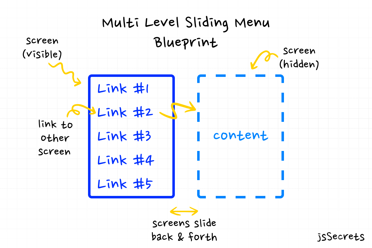
Working Principle
Simplest Working Version (SWV)
We have some number of screens. One of them is the main one, which is visible at the start. Other screens are hidden.
In HTML representation screen could be a <div> or in my case i use <ul>. All screens are wrapped with a parent <div>.
In CSS each screen is set to width: 100%. And parent <div> is set to overflow: hidden. These two facts together make only screen visible at the time. The visible screen is display:block, hidden ones are display:hidden. We can also set CSS visibility class to use in JS.
With the help of JS we show clicked section and hide the current.
Core concept
// javascript sliding menu
Let’s continue with core concept of how JS sliding multi level menu works.
1️⃣ HTML
// javascript sliding menu
The main parent element <.menu> contains three child elements. Let’s call them screens. We have one main screen and two descendant ones. Each screen contains items. And second level screens also have a “Back” button.
The a schematic markup looks like this:
<.menu>
   <.screen>
     <.back>
     <.item>...</.item>
     <.item>...</.item>
     <.item>...</.item>
     ...
   </.screen>

   <.screen>
      ...
   </.screen>

   ...
</.menu>
2️⃣ CSS
// javascript sliding menu
The main parent element <.menu> has display: flex in row direction. Static width value and overflow: hidden.
Each of the descendant screens is width: 100% and display: none.
And the screen that is currently active has a class of .show.
 .show {
     display: block;
  }
A combination of those facts means that in any moment of time only one screen is visible.
It resembles slider’s functionality.
3️⃣ Javascript
// javascript sliding menu
As in many cases with UI elements Javascript acts as “manager”.
In this case almost 100% of the work is adding and removing classes.
Let me show and explain the piece of code:
const goToHelp = () => {
  removeClass('show', mainMenu);
  addClass('show', helpMenu);
  addClass('slideLeftToZero', helpMenu);
  removeClassDelayed('slideLeftToZero', helpMenu, 500);
};
goToHelp() function navigates to the “Help” menu. And to do that, it removes class .show from the “Main menu” and add class .show to “Help menu”.
Even these two commands will do the work.
To create a sliding menu effect we need CSS animation.
That’s why the .slideLeftToZero class (simple CSS animation) is added to “Help menu”.
And the after .5s (random manual value) I remove the .slideLeftToZero class from “Help menu”. Because if class remains on the element we won’t see animation the second time.
Code explanation
// javascript sliding menu
If you have understood the core concept of how the Javascript sliding menu was built, the code will be easy to grasp.
HTML
// javascript sliding menu
I decided not to add <SVG> code for icons as theirs it takes too much space. I’ve just descriptively commented them.
But you can get all the HTML with <SVG> from Codepen or Github below in the “Resources”.
<body>

 <!-- wrapper -->
<div class="menu">

<!-- menu screen #1 -->
  <ul class="main-menu show">
    <li class="item">
      <div class="item-name">
        <svg>
            <!-- icon -->
        </svg>
        <span>Give Feedback</span>
      </div>
    </li>
    <li class="item">
      <div id="setting-privacy" class="item-name">
        <svg>
            <!-- icon -->
        </svg>

        <span>Settings & Privacy</span>
        <svg>
            <!-- navigate forward icon -->
        </svg>
      </div>
    </li>
    <li class="item">
      <div id="help-support" class="item-name">
        <svg>
            <!-- icon -->
        </svg>

        <span>Help & Support</span>
        <svg>
            <!-- navigate forward icon -->
        </svg>
      </div>
    </li>
    <li class="item">
      <div class="item-name">
        <svg>
            <!-- icon -->
        </svg>

        <span>Log Out</span>
      </div>
    </li>
  </ul>


<!-- menu screen #2 -->
  <ul class="settings-menu">
    <li id="back-btn-from-settings" class="item back">
      <div class="item-name">
        <svg>
            <!-- navigate back icon -->
        </svg>

        <span>Back</span>
      </div>
    </li>
    <li class="item">
      <div class="item-name">
        <svg>
            <!-- icon -->
        </svg>

        <span>Activity Log</span>
      </div>
    </li>
    <li class="item">
      <div class="item-name">
        <svg>
            <!-- icon -->
        </svg>
        <span>Preferences</span>
      </div>
    </li>
    <li class="item">
      <div class="item-name">
        <svg>
            <!-- icon -->
        </svg>

        <span>Language</span>
      </div>
    </li>
  </ul>


<!-- menu screen #3 -->
  <ul class="help-menu">
    <li id="back-btn-from-help" class="item back">
      <div class="item-name">
        <svg>
            <!-- navigate back icon -->
        </svg>

        <span>Back</span>
      </div>
    </li>
    <li class="item">
      <div class="item-name">
        <svg>
            <!-- icon -->
        </svg>

        <span>Help Center</span>
      </div>
    </li>
    <li class="item">
      <div class="item-name">
        <svg>
            <!-- icon -->
        </svg>

        <span>Support</span>
      </div>
    </li>
    <li class="item">
      <div class="item-name">
        <svg>
            <!-- icon -->
        </svg>
        <span>Report a Problem</span>
      </div>
    </li>
  </ul>
</div>

</body>
CSS
// javascript sliding menu
/* basic reset */
*,
::before,::after {
  margin: 0;
  padding: 0;
  box-sizing: border-box;
  font-family: "Urbanist", sans-serif;
}

ul {
  list-style: none;
}

body {
  height: 100vh;
  background: radial-gradient(circle, rgb(255, 255, 255) 70%, rgb(243, 243, 243) 100%);
  position: relative;
  display: flex;
  justify-content: center;
  align-items: center;
  overflow: hidden;
}

.menu {
  width: 300px;
  padding: 20px;
  display: flex;
  border-radius: 9px;
  box-shadow: 0 10px 25px rgba(124, 130, 141, 0.2);

/*overflow is hidden*/
  overflow: hidden;


/* Glassmorphism effect */
  background: rgba(255, 255, 255, 0.55);
  backdrop-filter: blur(4.5px);
  -webkit-backdrop-filter: blur(4.5px);
  border: 1px solid rgba(255, 255, 255, 0.18);
}
.menu .main-menu,
.menu .settings-menu,
.menu .help-menu {
  width: 100%;
  height: 100%;

/* default display value */
  display: none;

  border-radius: 9px;
  transition: all 0.3s linear;
}
.menu .main-menu.show,
.menu .settings-menu.show,
.menu .help-menu.show {


/* when screen is shown - display value */
  display: block;
}


/* decoration styles */
.menu .main-menu .item:nth-of-type(1):hover {
  background: #7b42d1;
  box-shadow: 0 10px 25px rgba(123, 66, 209, 0.4);
}
.menu .main-menu .item:nth-of-type(2):hover {
  background: #f7ce51;
  box-shadow: 0 10px 25px rgba(245, 205, 81, 0.4);
}
.menu .main-menu .item:nth-of-type(3):hover {
  background: #5bc5fa;
  box-shadow: 0 10px 25px rgba(42, 179, 248, 0.4);
}
.menu .main-menu .item:nth-of-type(4):hover {
  background: #eb3dae;
  box-shadow: 0 10px 25px rgba(222, 23, 152, 0.4);
}
.menu .settings-menu .item:hover {
  background: #f7ce51;
  box-shadow: 0 10px 25px rgba(245, 205, 81, 0.4);
}
.menu .settings-menu .item.back {
  background: transparent;
  box-shadow: none;
  opacity: 0.7;
}
.menu .settings-menu .item.back:hover {
  opacity: 1;
}
.menu .help-menu .item:hover {
  background: #5bc5fa;
  box-shadow: 0 10px 25px rgba(42, 179, 248, 0.4);
}
.menu .help-menu .item.back {
  background: transparent;
  box-shadow: none;
  opacity: 0.7;
}
.menu .help-menu .item.back:hover {
  opacity: 1;
}

.item {
  padding: 16px;
  border-radius: 9px;
  background: white;
  box-shadow: 0 10px 25px rgba(124, 130, 141, 0.2);
  cursor: pointer;
  position: relative;
  transition: all 0.3s ease;
}
.item:not(.back):hover span {
  color: white;
  transition: all 0.2s ease-out;
}
.item:not(.back):hover path {
  fill: white;
  transition: all 0.2s ease-out;
}
.item span {
  font-size: 20px;
}
.item.back {
  box-shadow: none;
}
.item.back > * {
  opacity: 0.5;
}
.item.back .item-icon {
  opacity: 0.5;
}
.item:not(:last-of-type) {
  margin-bottom: 16px;
}
.item-name {
  font-size: 20px;
  color: #292d34;
}
.item-icon {
  vertical-align: sub;
  margin-right: 10px;
}
.item-icon.back {
  position: relative;
  top: -2px;
}
.item .chevron-icon {
  position: absolute;
  right: 16px;
  top: 50%;
  transform: translate(0, -50%);
}


/* animations */

@keyframes slideLeftToZero {
  from {
    opacity: 0;
    transform: translateX(100%);
  }
  to {
    opacity: 1;
    transform: translateX(0);
  }
}
@keyframes slideRightToZero {
  from {
    opacity: 0;
    transform: translateX(-100%);
  }
  to {
    opacity: 1;
    transform: translateX(0);
  }
}
.slideLeftToZero {
  animation: slideLeftToZero 0.5s ease-out forwards;
}

.slideRightToZero {
  animation: slideRightToZero 0.5s ease-out forwards;
}
Javascript
// javascript sliding menu
// Variables
const mainMenu = document.querySelector('.main-menu');
const settingsMenu = document.querySelector('.settings-menu');
const helpMenu = document.querySelector('.help-menu');

const settingsPrivacyBtn = document.querySelector('#setting-privacy');
const helpSupportBtn = document.querySelector('#help-support');
const backBtnFromSettings = document.querySelector('#back-btn-from-settings');
const backBtnFromHelp = document.querySelector('#back-btn-from-help');

// Functions

// utililty functions
// I decided to wrap into functions
// adding, removing class and removing class on delay
// as they are used more than once

// it is a good practice of DRY code
// DRY = Don't Repeat Yourself

const addClass = (className, element) => {
  element.classList.add(className);
};
const removeClass = (className, element) => {
  element.classList.remove(className);
};
const removeClassDelayed = (className, element, delay) => {
  setTimeout(() => {
    removeClass(className, element);
  }, delay);
};


// following functions are very similar

// as you can see
// we remove class .show from the active screen
// and add class .show to one we would like to see

// then we add animation class
// .slideLeftToZero or .slideRightToZero
// it depends on a slide direction
// to see the sliding effect

// and after half of the second
// the animation class is removed
// so the animation could be repeated in the future

const goToSettings = () => {
  removeClass('show', mainMenu);
  addClass('show', settingsMenu);
  addClass('slideLeftToZero', settingsMenu);
  removeClassDelayed('slideLeftToZero', settingsMenu, 500);
};

const goToHelp = () => {
  removeClass('show', mainMenu);
  addClass('show', helpMenu);
  addClass('slideLeftToZero', helpMenu);
  removeClassDelayed('slideLeftToZero', helpMenu, 500);
};

const goFromSettings = () => {
  removeClass('show', settingsMenu);
  addClass('show', mainMenu);
  addClass('slideRightToZero', mainMenu);
  removeClassDelayed('slideRightToZero', mainMenu, 500);
};

const goFromHelp = () => {
  removeClass('show', helpMenu);
  addClass('show', mainMenu);
  addClass('slideRightToZero', mainMenu);
  removeClassDelayed('slideRightToZero', mainMenu, 500);
};

// Event Listeners
settingsPrivacyBtn.addEventListener('click', goToSettings);
helpSupportBtn.addEventListener('click', goToHelp);
backBtnFromSettings.addEventListener('click', goFromSettings);
backBtnFromHelp.addEventListener('click', goFromHelp);
Project Ideas
// javascript sliding menu
1️⃣ Create a sliding multi level menu with three or more nested levels. You can play with iPhone’s “Settings” menu and see yourself.
2️⃣ Add this JS sliding menu to a navbar as a dropdown item. You can see a live example at Facebook website.
3️⃣ Think on a different style and direction of animation. Now it comes from left and right, try from top and bottom or even from front and behind 🙂

What to do next?
You can check out my similar projects:
Resources
// javascript sliding menu
1️⃣ jssecrets.com
2️⃣ Online illustrations by Storyset
3️⃣ Technology illustrations by Storyset