In this tutorial I will share how I built Dark/Light Mode Toggle Switch aka Dark Mode JS with CSS and Javascript.
Dark Mode has become popular in a recent years on websites and apps. And understand how to implement this feature in your project could nice add-on to your portfolio.
There are many Dark Mode examples in Internet, but I decided to combine it with SVG animation: “Sun into Moon” and back. 😎
So, let’s go and see the project in action below ⬇️
Project: Dark/Light Mode Toggle (Dark Mode JS)
// dark mode js
See the Pen Light/Dark Mode Toggle CSS/JS by jsSecrets (@jssecrets) on CodePen.
Table of Contents
Basic Working Principle
// dark mode js
What is Dark Mode in a nutshell?
// dark mode js
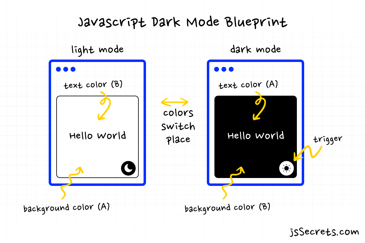
Dark Mode is a second interface style of an app or website, and the user can choose between dark and standard (light) versions.
In most basic case Dark Mode is a color inversion of Light Mode.
Light Mode: Background is white. Text is black.
Dark Mode: Background is black. Text is white.
Working Principle
// dark mode js
As stated above, when user toggles between Dark and Light modes color inversion takes place.
For better retrospective let’s imagine that every color is a “box”.
In Light Mode the “box” contains one value [🟨]and in Dark Mode a different one [🟦].
Simplest Working Version (SWV)
// dark mode js
The SWV would look like I explained above.
Light Mode: Background is white. Text is black.
Dark Mode: Background is black. Text is white.
In our CSS file we set two pairs of color values.
First pair for background:
ex: white (light mode), black (dark mode).
Second pair for text:
ex: black (light mode), white (dark mode).
And we also need a toggle button to switch between states.
Core concept
// dark mode js
Let’s start with core concept of how all of this works.
1️⃣ HTML
// dark mode js examples
In this particular case I have iPhone made with HTML. (you can have standard HTML elements).
The container is .iphone.
It contains some decorative elements .speaker, .camera and .moon.
Also text elements.
.trigger that acts as toggle switch button.
.overlay – this layer is dark color. It scales up and down when toggling between modes.
2️⃣ CSS
// dark mode js examples
The core of styles logic is very simple.
I use CSS variables.
Light Mode ☀️ values
html {
  --color-body: white;
  --border-inner: #e4e4e4;
  --border-mid: #e8e8e8;
  --border-outer: #eeeeee;
  --bottom-line: #e4e4e4;
  --top-line: #e4e4e4;
  --speaker: #efefef;
  --camera: #efefef;
  --shadow: #8a8a8a;
  --text: #1f1f1f;
}
Dark Mode 🌑 values
html.dark {
  --color-body: #1f1f1f;
  --border-inner: #1f1f1f;
  --border-mid: #191919;
  --border-outer: #111111;
  --bottom-line: #1f1f1f;
  --top-line: #1f1f1f;
  --speaker: #101010;
  --camera: #101010;
  --shadow: #111111;
  --text: #e4e4e4;
}
When mode changes, so the value of the variables, so the colors of the elements on the page.
▶️ CSS helps to animate sun ☀️ into crescent 🌒 by animating SVG path.
3️⃣ Javascript
// dark mode examples
JS has only one toggle function that helps to switch between Light and Dark modes.
Code explanation
// dark mode examples
If you have understood the core concept and working principle of how to Dark Mode JS is built, the code will be easy to grasp.
HTML
// how to make dark mode in html
<body>
<!--decorative element-->
  <div class="circle"></div>

<!--iPhone-->
    <div class="iphone">
      <div class="speaker"></div>
      <div class="camera"></div>
      <div class="moon">

<!--SVG of Sun/Moon-->
        <svg
          width="160"
          height="160"
          viewBox="0 0 160 160"
          fill="none"
          xmlns="http://www.w3.org/2000/svg"
        >

<!--path of SVG (sun(circle)). It will transformed into crescent with CSS-->
          <path
            d="M160 80C160 124.183 124.183 160 80 160C35.8172 160 0 124.183 0 80C0 35.8172 35.8172 0 80 0C124.183 0 160 35.8172 160 80Z"
            fill="url(#paint0_linear_37_12)"
          />
          <defs>
            <linearGradient
              id="paint0_linear_37_12"
              x1="39"
              y1="13"
              x2="121"
              y2="147"
              gradientUnits="userSpaceOnUse"
            >
              <stop class="stop-1" />
              <stop offset="1" class="stop-2" />
            </linearGradient>
          </defs>
        </svg>
      </div>

      <div class="text">
        <div class="title">Choose a mode</div>
        <div class="body">Light or Dark</div>
      </div>

<!--trigger button-->
      <div class="trigger"></div>

<!--dark overlay. It scales up and down. -->
      <div class="overlay"></div>
    </div>
</body>
CSS
// how to make dark mode in html
/*basic reset*/

*,
::before,
::after {
  margin: 0;
  padding: 0;
  box-sizing: border-box;
  font-family: "Poppins", sans-serif;
}

ul {
  list-style: none;
}

body {
  height: 100vh;

/*property is set through CSS variable*/
/*which means it can contain different values under different classes*/
  background: var(--color-body);


  position: relative;
  display: flex;
  justify-content: center;
  align-items: center;
  overflow: hidden;
}

/*transition is set for all elements*/
/*this will make our color changing smoother*/
html * {
  transition: all 750ms !important;
  transition-delay: 0 !important;
}

/*color values for Light Mode*/
html {
  --color-body: white;
  --border-inner: #e4e4e4;
  --border-mid: #e8e8e8;
  --border-outer: #eeeeee;
  --bottom-line: #e4e4e4;
  --top-line: #e4e4e4;
  --speaker: #efefef;
  --camera: #efefef;
  --shadow: #8a8a8a;
  --text: #1f1f1f;
}
html .stop-1 {
  stop-color: #f84f63;
}
html .stop-2 {
  stop-color: #f8792b;
}

/*iphone*/
html .iphone {
  position: relative;
  width: 270px;
  height: 585px;
  background-color: #f5f5f5;
  border-radius: 40px;
  box-shadow: 0px 0px 0px 11px var(--border-inner), 0px 0px 0px 13px var(--border-mid), 0px 0px 0px 20px var(--border-outer), 0px 20px 40px var(--shadow);
  overflow: hidden;
}
@media (max-width: 440px) {
  html .iphone {
    width: 240px;
  }
}
@media (max-width: 320px) {
  html .iphone {
    width: 208px;
  }
}

/* bottom line and top panel*/
html .iphone:before, html .iphone:after {
  content: "";
  position: absolute;
  left: 50%;
  transform: translateX(-50%);
  z-index: 2;
}

/*bottom line*/
html .iphone:after {
  bottom: 7px;
  width: 105px;
  height: 4px;
  background-color: var(--bottom-line);
  border-radius: 10px;
}

/*top panel*/
html .iphone:before {
  top: 0px;
  width: 56%;
  height: 30px;
  background-color: var(--top-line);
  border-radius: 0px 0px 40px 40px;
}

/*speaker and camera*/
html .iphone .speaker,
html .iphone .camera {
  position: absolute;
  display: block;
  color: transparent;
  z-index: 3;
}

/*speaker*/
html .iphone .speaker {
  top: 0px;
  left: 50%;
  transform: translate(-50%, 6px);
  height: 8px;
  width: 20%;
  background-color: var(--speaker);
  border-radius: 8px;
  box-shadow: inset 0px -3px 3px 0px rgb(255, 255, 255);
}

/*camera*/
html .iphone .camera {
  left: 10%;
  top: 0px;
  transform: translate(150px, 4px);
  width: 12px;
  height: 12px;
  background-color: var(--camera);
  border-radius: 12px;
  box-shadow: inset 0px -3px 2px 0px rgb(255, 255, 255);
}

/*camera eye (lens)*/
html .iphone .camera::after {
  content: "";
  position: absolute;
  background-color: #2d4d76;
  width: 6px;
  height: 6px;
  top: 2px;
  left: 2px;
  top: 3px;
  left: 3px;
  display: block;
  border-radius: 4px;
  box-shadow: inset 0px -2px 2px rgba(0, 0, 0, 0.5);
}

/*moon*/
html .iphone .moon {
  width: 160px;
  height: 160px;
  border-radius: 50%;
  position: absolute;
  left: 50%;
  top: 20%;
  transform: translate(-50%, -20%) rotate(-45deg);
  transition: all 1s ease-out;
  z-index: 2;
}
html .iphone .moon svg path {
  transition: all 0.5s ease-out;
}

/*text*/
html .iphone .text {
  position: absolute;
  left: 50%;
  top: 60%;
  transform: translate(-50%, -60%);
  width: 100%;
  padding: 20px;
  text-align: center;
  color: var(--text);
  z-index: 2;
  user-select: none;
}
html .iphone .text .title {
  font-size: 20px;
  font-weight: 900;
}

/*trigger*/
html .iphone .trigger {
  width: 50px;
  height: 50px;
  border-radius: 50%;
  cursor: pointer;
  background: #111111;
  background-image: url(../img/moon.svg);
  background-size: 28px;
  background-position: center center;
  background-repeat: no-repeat;
  position: absolute;
  left: 50%;
  top: 80%;
  transform: translate(-50%, -80%);
  z-index: 1;
  transform-style: preserve-3d;
  transition: all 0.5s ease-out;
}

/*outer circle for on:hover scale effect*/
html .iphone .trigger::after {
  content: "";
  position: absolute;
  width: 100%;
  height: 100%;
  border-radius: 50%;
  background: #111111;
  transform: translateZ(-1px);
  transition: all 0.5s ease-out;
}
html .iphone .trigger:hover::after {
  transform: translateZ(-1px) scale(1.5);
}

/*overlay*/
/*it stays beneath the trigger on Light Mode*/
html .iphone .overlay {
  width: 48px;
  height: 48px;
  border-radius: 50%;
  background: #111111;
  position: absolute;
  left: 50%;
  top: 80%;
  transform: translate(-50%, -80%);
  transition: all 0.75s ease-out;
}

/*decorative circle behind the iphone*/
html .circle {
  width: 700px;
  height: 700px;
  border-radius: 50%;
  background: #000;
  position: absolute;
  top: -300px;
  background: linear-gradient(90deg, #f84f63 0%, #f8792b 100%);
  box-shadow: 0px 8px 16px rgba(248, 121, 43, 0.25);
}
@media (max-width: 767.9px) {
  html .circle {
    width: 400px;
    height: 400px;
    top: -160px;
  }
}
@media (max-width: 440px) {
  html .circle {
    display: none;
  }
}

/*color values for Dark Mode*/
html.dark {
  --color-body: #1f1f1f;
  --border-inner: #1f1f1f;
  --border-mid: #191919;
  --border-outer: #111111;
  --bottom-line: #1f1f1f;
  --top-line: #1f1f1f;
  --speaker: #101010;
  --camera: #101010;
  --shadow: #111111;
  --text: #e4e4e4;
}
html.dark .stop-1 {
  stop-color: #8079f0;
}
html.dark .stop-2 {
  stop-color: #82abf2;
}

/*to cover angles of the phone's screen*/
/*without changing background color white edges are visible*/
html.dark .iphone {
  animation: toBlack 0.7s both;
}

/*change inner shadow for proper light cast*/
html.dark .speaker {
  box-shadow: inset 0px -3px 3px 0px rgba(255, 255, 255, 0.2);
}

/*change inner shadow for proper light cast*/
html.dark .camera {
  box-shadow: inset 0px -3px 2px 0px rgba(255, 255, 255, 0.2);
}

/*change sun into crescent. SVG animation.*/
html.dark .moon svg path {
  d: path("M38.5 80C38.5 124.183 80 163 80 160C35.8172 160 0 124.183 0 80C0 35.8172 35.8172 0 80 0C80 0 38.5 35.8172 38.5 80Z");
}

/*change icon from moon into sun*/
html.dark .trigger {
  background-image: url(../img/sun.svg);
}

/*increase size of the overlay to cover the whole phone screen*/
html.dark .overlay {
  transform: translate(-50%, -80%) scale(20);
}

/*change color of the circle behind the phone*/
html.dark .circle {
  background: linear-gradient(90deg, #8079f0 0%, #82abf2 100%);
  box-shadow: 0px 8px 16px rgba(131, 173, 243, 0.25);
}

/*
need animation of the background to cover angles of the phone
otherwise there are small light segments which are visible
*/
@keyframes toBlack {
  0% {
    background-color: #f5f5f5;
  }
  90% {
    background-color: #f5f5f5;
  }
  100% {
    background-color: #111111;
  }
}
Javascript
// how to make dark mode in html
// Variables
const html = document.documentElement;
const trigger = document.querySelector('.trigger');

// Functions
const toggleMode = () => {
  html.classList.toggle('dark');
};

// Event Listeners
trigger.addEventListener('click', toggleMode);
Project Ideas
// dark mode with javascript
1️⃣ Build Dark Mode feature using localStorage
2️⃣ Build app where user can toggle between multiple Color Schemes
Frequently Asked Questions
// dark mode with javascript
1️⃣ What is dark mode?
Dark mode is a color scheme for computer or mobile device displays that uses light-colored text and icons on a dark background.
It is intended to reduce the strain on the user’s eyes and improve the display’s readability in low-light conditions. Dark mode is also more energy efficient on some devices with OLED or AMOLED displays.
2️⃣ Is dark mode better than light mode?
Whether dark mode is better than light mode depends on individual preferences and usage scenarios.
For some users, dark mode may provide better eye comfort and improved readability in low-light conditions, and may also extend battery life on some devices with OLED or AMOLED displays.
On the other hand, light mode can provide a brighter and more vivid display, and may be easier to read in bright light conditions.
Ultimately, the choice between dark mode and light mode comes down to personal preference and the specific needs and habits of the user. Some users may switch between dark and light mode depending on the time of day or their current environment.
3️⃣ Is dark mode harmful?
There is no scientific evidence that dark mode is harmful to the eyes or causes any long-term harm.
However, like any other display mode, prolonged screen use in dark mode can still lead to eye strain and fatigue, especially if the screen brightness is set too high or if the user does not take breaks from screen use.
It is always a good idea to take breaks from screen use, adjust the screen brightness to a comfortable level, and follow other ergonomic practices to reduce the risk of eye strain and fatigue, regardless of whether you use dark mode or light mode.
4️⃣ Why dark mode is so popular?
Dark mode has gained popularity for several reasons:
1️⃣ Eye comfort: Dark mode provides a high contrast between the text and background, reducing eye strain and making it easier to read in low-light environments.
2️⃣ Battery life: On devices with OLED displays, dark pixels consume less power compared to light pixels, which can result in longer battery life when using dark mode.
3️⃣ Aesthetic appeal: Many users find dark mode to be more visually appealing and modern.
4️⃣ Accessibility: For individuals with certain visual impairments, dark mode can improve the readability of text and enhance the overall user experience.
5️⃣ System-wide adoption: With the increasing popularity of dark mode, more and more software and operating systems are adopting this feature, providing users with a consistent experience across different platforms.
6️⃣ Personalization: The ability to choose between light and dark mode allows users to personalize their device and make it more suited to their preferences and needs.
What to do next?
// dark mode with javascript
You can check out my Javascript Like Button project or Hamburger Menu CSS Animation.
Resources
// dark mode with javascript
1️⃣ jssecrets.com
2️⃣ User illustrations by Storyset
3️⃣ People illustrations by Storyset
4️⃣ How to Build Modern Dark/Light Mode Toggle☀️-🌑 (Dark Mode JS) Codepe