In this tutorial I will share how I built custom Javascript Select Dropdown with CSS and Javascript.
As a Web designer I always make sure that my UI elements look consistent across different browsers and OSs. And HTML select element looks different in every browser. Thus it’s an important skill to know how to style this element.
As a UI designer I decided to use a Glassmorphism UI style for this project.
So, let’s go and see the project in action below ⬇️
Project: Custom Javascript Select Dropdown
// how to create custom Javascript Select Dropdown
See the Pen Custom Dropdown Javascript by jsSecrets (@jssecrets) on CodePen.
Table of Contents

Basic Working Principle
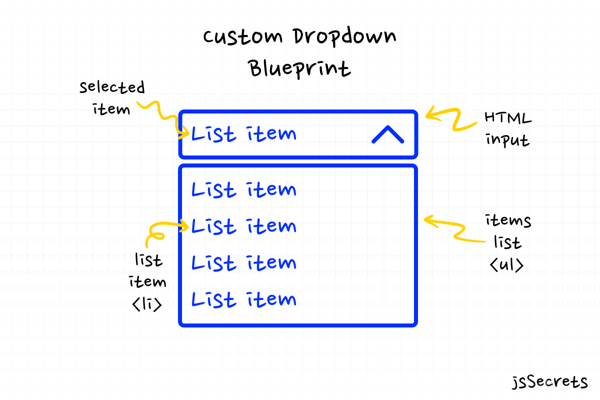
What is Custom Select Dropdown in a nutshell?
Custom <select> component consists of two elements:
1️⃣ HTML Input
We need HTML input as we need functionality to submit information from our custom dropdown.
2️⃣ List of text elements
To resemble <option> we can use <ul> with <li>s or just <div>s. Then we add a :hover state and basic <select> behavior is ready. 😎
Working Principle
Simplest Working Version (SWV)
We can use <input> and <ul> with <li>s to create a component’s skeleton and visual look.
And add a JS for interactivity.
When user clicks the on the input, a pane with options appears.
When user clicks outside of the component, a pane with options disappears.
When user clicks on “<option>“, its value is added to the input.
Core concept
// how to create custom CSS select menu
Let’s continue with core concept of how custom JS select dropdown menu works.
1️⃣ HTML
// how to build custom Javascript Select Dropdown
I used wrapper .dropdown as a container for <input> and <ul>. <input> has a readonly attribute to prevent direct interaction with this itself.
2️⃣ CSS
// how to code custom Javascript Select Dropdown
No extraordinary or specific styles were used for this custom dropdown.
Just basic styling.
3️⃣ Javascript
// how to style select dropdown css
There are several functions I have in play for our custom select dropdown menu.
toggleDropdown() – toggles (open/close) states for dropdown list. By default the options list is hidden.
selectOption() – enables the selection process inside the dropdown menu list. After the selection option is clicked, its value copied into input.
closeDropdownFromOutside() – enables closing action of the custom dropdown list if clicked outside (ex: nothing is selected)
As you can see, we decomposed (reverse engineered) how HTML select element works 😀
Code explanation
// how to style select dropdown menu
If you have understood the core concept of how custom Javascript select dropdown menu was built, the code will be easy to grasp.

HTML
// how to style select dropdown options
<body>

<!-- wrapper/container for custom dropdown select -->
    <div class="dropdown">

<!-- input has "readonly" attribute to prevent typing interaction -->
      <input type="text" placeholder="Pick a technology" readonly />

<!-- options list -->
      <ul class="options">
        <li class="option">UI Design</li>
        <li class="option">HTML</li>
        <li class="option">CSS</li>
        <li class="option">JS</li>
      </ul>

    </div>

</body>
CSS
// how to style default select dropdown
/* basic reset */
*,
::before,
::after {
  margin: 0;
  padding: 0;
  box-sizing: border-box;
  font-family: "Poppins", sans-serif;
}

ul {
  list-style: none;
}

body {
  height: 100vh;
  background: radial-gradient(circle, rgb(255, 255, 255) 70%, rgb(243, 243, 243) 100%);
  position: relative;
  display: flex;
  justify-content: center;
  align-items: center;
  overflow: hidden;
}


.dropdown {
  width: 288px;
  height: 64px;
  background: white;
  border-radius: 9px;
  box-shadow: 0 10px 25px rgba(42, 179, 248, 0.4);
  position: relative;
  top: -80px;
}

/* arrow CSS icon */

/* a good example of CSS graphics */
/* in my view its ineffective ? */
/* more than 10 lines of styles just to create an arrow */

.dropdown::before {
  content: "";
  position: absolute;
  right: 20px;
  top: 24px;
  z-index: 9999;
  width: 12px;
  height: 12px;
  border: 2px solid grey;
  border-top: transparent;
  border-right: transparent;
  transform: rotate(-45deg);
  pointer-events: none;
  transition: all 0.3s linear;
}
.dropdown input {
  width: 100%;
  height: 100%;
  border-radius: 9px;
  padding: 32px 24px;
  cursor: pointer;
  border: none;
  outline: none;
  box-shadow: 0 10px 25px rgba(124, 130, 141, 0.2);
  font-size: 20px;
  position: absolute;
  top: 0;
  left: 0;
  user-select: none;
}
.dropdown .options {
  width: 100%;
  border-radius: 9px;
  padding: 8px;
  cursor: pointer;
  background: white;
  border: none;
  outline: none;
  box-shadow: 0 10px 25px rgba(124, 130, 141, 0.2);
  font-size: 20px;
  overflow: hidden;
  position: absolute;
  top: 80px;
  transition: all 0.7s ease;
  background: rgba(255, 255, 255, 0.55);
  backdrop-filter: blur(4.5px);
  -webkit-backdrop-filter: blur(4.5px);
  border: 1px solid rgba(255, 255, 255, 0.18);

  /* default state of dropdown list */
  /* it is not visible */
  opacity: 0;
  transform: translateY(-50px);
  visibility: hidden;
}
.dropdown .options .option {
  padding: 16px;
  border-radius: 9px;
  transition: all 0.2s ease;
  color: #292d34;
}
.dropdown .options .option:not(:last-of-type) {
  margin-bottom: 8px;
}
.dropdown .options .option:hover {
  color: white;
  background: #5bc5fa;
  box-shadow: 0 10px 25px rgba(42, 179, 248, 0.4);
}


/* opened state of dropdown list */
.dropdown.opened .options {
  opacity: 1;
  visibility: visible;
  transform: translateY(0);
}
.dropdown.opened::before {
  transform: rotate(-225deg);
  top: 30px;
}
Javascript
// how to style select dropdown
// Variables


// dropdown container
const dropdown = document.querySelector('.dropdown');


// input
const input = document.querySelector('input');


// dropdown list elements
const listOfOptions = document.querySelectorAll('.option');

const body = document.body;


// Functions


// basic toggle (open/close) function
// "classList.toggle(className)" toggles 'opened' class

const toggleDropdown = (event) => {
  event.stopPropagation();
  dropdown.classList.toggle('opened');
};

// option selection from dropdown list
// used "event.currentTarget" to specify the selected option
// after option is chosen, its "textContent" value being copied to input's value

const selectOption = (event) => {
  input.value = event.currentTarget.textContent;
};


// we want the dropdown list to close when clicked outside of it
// ex: no option was selected
// we do a simple check below
// if dropdown list is in opened state
// then remove the ".opened" class

const closeDropdownFromOutside = () => {
  if (dropdown.classList.contains('opened')) {
    dropdown.classList.remove('opened');
  }
};

// Event Listeners

// if we click anywhere on "body" and dropdown list opened
// the dropdown will be closed

body.addEventListener('click', closeDropdownFromOutside);

// options selection

listOfOptions.forEach((option) => {
  option.addEventListener('click', selectOption);
});

// dropdown toggle
dropdown.addEventListener('click', toggleDropdown);
Project Ideas
// style native select dropdown
1️⃣ You can try to build a custom multi level context menu on a right click.
2️⃣ Integrate a custom select dropdown into website’s navigation menu.
3️⃣ Build a dropdown menu with 100+ options. For instance world’s countries or US states list with a search functionality thru input field.
4️⃣ Share your idea in the comments 😊✌

What to do next?
You can check out my similar projects:
3️⃣ Javascript Multi Level Menu
Resources
// change style of select dropdown
1️⃣ jssecrets.com
2️⃣ Online illustrations by Storyset
3️⃣ Online illustrations by Storyset

please i need to use your select dropdown menu but i have problem where i use your code for change my web language with anchor tag my page still refresh and can not change language correctly chan you help me ?
Good day!
I see what you are trying to achieve.
I suggest you to go from the easiest to more complex way.
The easiest is to use native HTML
selectwithoptions.When user selects the
optionthe Event takes place.In the case of changing the language I would mark each language element with “
data-LANGUAGE” (ex: data-english, data-spanish, etc).And when the particular
option(ex: spanish) is selected.First: hide all language elements.
Second: display the selected. (ex: spanish)
Hope this helps!
Quick suggestion: I used this for a drop down arrow:
.dropdown::before {
content: “\2193”;
position: absolute;
right: 2px;
top: -5px;
z-index: 9999;
pointer-events: none;
transition: all 0.3s linear;
}
.dropdown.opened::before {
transform: rotate(-180deg);
top: -3px;
}
Thanks for this, I integrated it into my code and it looks great. My app is 100% typescript, I had to tweak your javascript in a couple of places to make it compile.
Glad everything went well Mike 😊
Hi,
is there a way to reset the selection and show the placeholder again? Like a reset button.
Hi Peter 👋
To have a “reset”, you need to code this explicitly.
For instance, add one more item at the top of the list.
It’s like native HTML Select element’s behavior.