In this tutorial I will share how I built toast notification / snackbar UI element with CSS and Javascript.
As a web designer and developer I decided to make the snackbar as simple as possible.
So, let’s go and see the toast in action below ⬇️
Project: Toast notification (snackbar) in Javascript
See the Pen Snackbar (Toast) with Javascript by jsSecrets (@jssecrets) on CodePen.
Table of Contents
Basic Working Principle
What is Toast Notification in a nutshell?
Snackbar is a non-modal pane usually a relatively small size which contains some information.
It may be the error message, warning, cookie consent or notification.
On most the websites it usually appears in the top right or bottom right corner of the viewport.
Working Principle
Web designer creates a snackbar with HTML and CSS, sets it position:absolute to remove from normal document flow. And places toast at the corner.
Then web developer has to set two CSS states visible and hidden. Usually it is done with classes.
Lastly with JS define the conditions under which snackbar will appear and disappear.
Core concept
Let’s start with core concept of how all of this works.
1️⃣: HTML
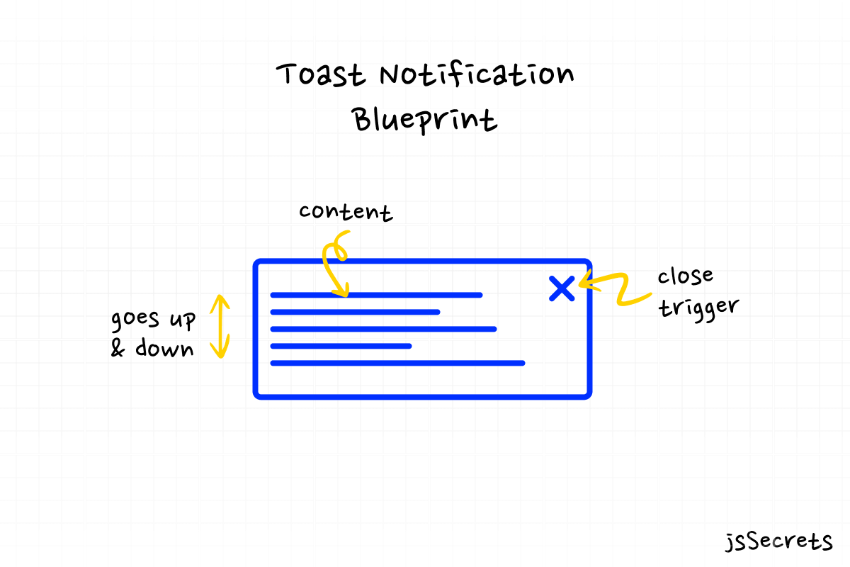
Toast notification is a <div> element which is filled with a content.
My snackbar has the following elements:
- title
- text message
- image
- close button
Good practice is not to over fill the snackbar with the elements. It has to be concise and minimalistic.
2️⃣: CSS
You can style a toast message component however you want, but usually it has a rectangular shape.
I used position: fixed and placed the snackbar at the bottom right corner.
Next, I applied transform: translateY(VALUE) to remove the toast notification from view.
And set the transform: translateY(VALUE#2)to bring the snackbar into view when the button is clicked.
3️⃣: Javascript
As you can see all the heavy lifting was performed in CSS. And JS will only be used as a “conductor of the orchestra” 🙂.
We have the click event set. When clicked I assign .isShown class to the toast notification and it appears from the bottom. After 5 seconds (can be any amount of time) the .isShown class is removed from the snackbar and it goes back down.
I also set “autohide” parameter. If it is true the toast message will disappear automatically in X seconds otherwise it will stay until the “close” button is clicked.

Code explanation
If you got an understanding of the core concept of how the toast notifications works, the code will be reasonably easy to understand.
HTML
<body>

<!--snackbar element-->
    <div class="snackbar">


<!--image-->
      <img class="snackbar-icon" src="{YOUR PATH}" />


<!--text elements: title and text message-->
      <div class="snackbar-text">
        <h2 class="snackbar-text-heading">Important notice!</h2>
        <p class="snackbar-text-paragraph">We accept MasterCard only.</p>
      </div>


<!--close button-->
      <svg
        class="snackbar-close-btn"
        width="22"
        height="22"
        viewBox="0 0 22 22"
        fill="none"
        xmlns="http://www.w3.org/2000/svg"
      >
        <circle opacity="0.12" cx="11" cy="11" r="10" fill="#22272F" />
        <path
          fill-rule="evenodd"
          clip-rule="evenodd"
          d="M1.75 11C1.75 5.89137 5.89137 1.75 11 1.75C16.1086 1.75 20.25 5.89137 20.25 11C20.25 16.1086 16.1086 20.25 11 20.25C5.89137 20.25 1.75 16.1086 1.75 11ZM11 0.25C5.06294 0.25 0.25 5.06294 0.25 11C0.25 16.9371 5.06294 21.75 11 21.75C16.9371 21.75 21.75 16.9371 21.75 11C21.75 5.06294 16.9371 0.25 11 0.25ZM8.53033 7.46967C8.23744 7.17678 7.76256 7.17678 7.46967 7.46967C7.17678 7.76256 7.17678 8.23744 7.46967 8.53033L9.93934 11L7.46967 13.4697C7.17678 13.7626 7.17678 14.2374 7.46967 14.5303C7.76256 14.8232 8.23744 14.8232 8.53033 14.5303L11 12.0607L13.4697 14.5303C13.7626 14.8232 14.2374 14.8232 14.5303 14.5303C14.8232 14.2374 14.8232 13.7626 14.5303 13.4697L12.0607 11L14.5303 8.53033C14.8232 8.23744 14.8232 7.76256 14.5303 7.46967C14.2374 7.17678 13.7626 7.17678 13.4697 7.46967L11 9.93934L8.53033 7.46967Z"
          fill="#7C828D"
        />
      </svg>
    </div>

<!--toast notification trigger button-->
    <div class="show-snackbar-btn">
      <img src="{YOUR PATH}" />
    </div>

</body>CSS
/*basic reset*/

* {
  margin: 0;
  padding: 0;
  box-sizing: border-box;
  font-family: "Poppins", sans-serif;
}

body {
  height: 100vh;
  background: radial-gradient(circle, rgb(255, 255, 255) 70%, rgb(243, 243, 243) 100%);
  position: relative;
}

.snackbar {
  width: 300px;
  height: 80px;
  background: white;
  border-radius: 8px;
  box-shadow: 0 10px 25px rgba(124, 130, 141, 0.2);

  /* I use transition for smooth appearance and disappearance */
  transition: transform 0.6s ease-out;

  /* with position: fixed I place snackbar at bottom right corner */
  position: fixed;
  right: 30px;
  bottom: 0px;

  /* with z-index: 100 toast notifications will be on the top */
  /* relative to other objects */
  z-index: 100;

  /*
     transform: translateY(90px) sets the snackbar
     out of the viewport
     90px is a custom value
     I have determined it by experimenting
  */
  transform: translateY(90px);
}
@media (max-width: 575.9px) {
  .snackbar {
    right: 10px;
  }
}

  /*
    transform: translateY(-30px) sets
    the toast notification inside the viewport
    -30px is a manual value
     I have determined it by experimenting
  */

.snackbar.isShown {
  transform: translateY(-30px);
}

  /* for toast notification elements */
  /* I decided to use absolute positioning */

.snackbar-icon {
  max-width: 60px;
  position: absolute;
  top: 50%;
  left: 10px;
  transform: translateY(-50%);
}
.snackbar-text {
  position: absolute;
  top: 50%;
  transform: translateY(-50%);
  left: 90px;
  font-size: 12px;
}
.snackbar-text-heading {
  margin-bottom: 8px;
  color: #292d34;
  font-size: 16px;
  font-weight: 900;
}
.snackbar-text-paragraph {
  color: #7c828d;
}
.snackbar-close-btn {
  position: absolute;
  top: 50%;
  left: calc(100% - 10px);
  transform: translate(-100%, -50%);
  cursor: pointer;
}

  /* trigger button styles */
.show-snackbar-btn {
  width: 160px;
  height: 160px;
  background: white;
  border-radius: 100%;
  box-shadow: 0 10px 25px rgba(124, 130, 141, 0.2);
  cursor: pointer;
  transition: all 0.25s ease-out;
  position: absolute;
  top: 50%;
  left: 50%;
  transform: translate(-50%, -50%);
}
.show-snackbar-btn:hover {
  transform: translate(-50%, calc(-50% - 5px));
}
.show-snackbar-btn img {
  max-width: 70%;
  position: absolute;
  top: 50%;
  left: 50%;
  transform: translate(-50%, -50%);
}
Javascript
// Variables
const showSnackbarBtn = document.querySelector('.show-snackbar-btn');
const snackbar = document.querySelector('.snackbar');
const closeBtn = document.querySelector('.snackbar-close-btn');

// Functions

// this function adds .isShown class
// to the snackbar element
// I also added "autohide" parameter
// which controls whether the toast message
// goes out of the viewport automatically

const showSnackbar = (autohide) => {
  snackbar.classList.add('isShown');

// if "autohide" is "true"
// then the toast message
// will dissapear in 5 seconds
// otherwise user can close it manually

  if (autohide) {
    setTimeout(hideSnackbar, 5000);
  }
};

// this function removes .isShown class
// from toast message

const hideSnackbar = () => {
  snackbar.classList.remove('isShown');
};

// Event listeners

// I use .bind() method to input
// "true" or "false" value for "autohide" parameter
// "null" belongs to .bind() method

showSnackbarBtn.addEventListener('click', showSnackbar.bind(null, false));
closeBtn.addEventListener('click', hideSnackbar);

Project Ideas
1️⃣ You can add animated SVG icon or Lottie animation to your snackbar element to make it more creative and modern
Frequently Asked Questions
1️⃣ What are toast notifications?
A toast notification or Javascript toast or snackbar is a non modal, user interface element that is used to display informational messages to a users of the website or app.
2️⃣ Why is it called toast notification?
It is called toast message because of it appearance. It usually emerges from the bottom of the screen and resembles the bread pieces come out from the toaster 🙂
3️⃣ When to use toast messages?
A good practice to use a snackbar is when you want to show some relevant or situational information to the user.
For instance, some warning or error messages during form validation process.
I have seen that some internet stores use it as social proof saying that someone has just bought their product.
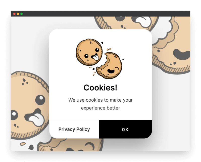
A common example would a cookie policy consent message.
4️⃣ Toast notification vs push notification?
Toast messages is a simple UI element that can built only with front end tools.
Push notification is more complex. Push and Notification are two different APIs.
Push — it is invoked when the server supplies information to a Service Worker.
Notification — this is the action of a Service Worker or a script in a web app that shows information to the user.

What to do next?
You can explore some of my other User Interface elements projects:
2️⃣ Dynamic JS Accordion
3️⃣ JS Popup/Modal
Resources
1️⃣ jssecrets.com
2️⃣ Work illustrations by Storyset
3️⃣ Online illustrations by Storyset