In this tutorial I will share how I built hamburger menu CSS animation with Javascript.
The hamburger menu animation is not an essential element on the website, but I think, it adds some classiness to the project. 😎 Specifically to the VFX part 🙂✌
There are different approaches you can take to accomplish this task. Probably the most evident is to use SVG. But I decided to use pure CSS to create hamburger to X (cross) animation.
As a UI designer, I decided to style hamburger menu in Modern Minimal UI style 😍.
So, let’s go and see the project in action below ⬇️
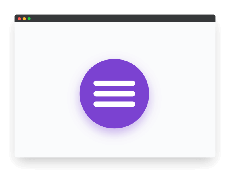
Project: Hamburger Menu Animation CSS
// hamburger to x animation
See the Pen CSS Animated Close Button Javascript by jsSecrets (@jssecrets) on CodePen.
Table of Contents

Basic Working Principle
// hamburger to x animation
What is Hamburger Menu in a nutshell?
// hamburger menu to x animation
Generally, there are three horizontal lines stacked vertically [ ☰ ]. And together they resemble a burger: two burger buns and meat in the middle 🍔. This is where the name comes from. 😊
Horizontal lines could be created in different ways.
1️⃣ First is the CSS method (the one we use in this project) – simply HTML elements with width, height, and background color.
2️⃣ SVG – draw three lines in any software (ex: Figma ❤️) and then manage that SVG code with CSS.
3️⃣ Lottie is probably a bit exotic 🙂 but it allows you to create a complicated animations in After Effects and the use them on the websites.

Working Principle
// hamburger menu to x animation
There are two versions of 🍔 hamburger menu.
1️⃣ No animation
After a user clicks the burger icon [ ☰ ], the hamburger icon disappears and a cross icon appears and vice versa.
2️⃣ CSS animation
After a user clicks a hamburger icon [ ☰ ] three lines visually transform into a cross (X) i.e. animation/transition takes place.
Simplest Working Version (SWV)
The Simplest Working Version would #1️⃣ with no animation.
Core concept
// hamburger menu animation css
Let’s continue with a core concept of how the hamburger menu CSS animation works.
1️⃣ HTML
// hamburger menu animation css
HTML elements .button and .trigger act as containers. <span> and its pseudo-elements (&::before, &::after) are the actual horizontal lines of the burger menu.
<div class="button">
  <div class="trigger">
    <span></span>
  </div>
</div>
2️⃣ CSS
// hamburger menu animation css
CSS is where all the work takes place.
<span> and its pseudo-elements (&::before, &::after) are being drawn with CSS i.e. three horizontal lines [ ☰ ]
The icon has two states:
#1 – hamburger state ( ☰ ) i.e. hypothetical menu (ex: sidebar) is closed
#2 – cross state ( X ) i.e. hypothetical menu (ex: sidebar) is opened
In CSS we have position values of the burger horizontal lines for both states.
And animations are performed with CSS animations 😊
3️⃣ Javascript
// how to make a hamburger menu javascript
JS is used simply for toggling between two states: hamburger state ( ☰ ) and cross ( X ) state.

Code explanation
// css burger menu animation
If you have understood the core concept and working principle of how to CSS hamburger menu animation is built, the code will be easy to grasp.
HTML
// css animation hamburger menu
<body>
<!---->

<div class="button">
  <div class="trigger">

<!--element for burger menu-->
    <span></span>

<!--why is it only one <span>?-->
<!--I thought it should be three. You may ask. 😊-->
<!--Good question!-->
<!--the other two will be created with CSS as pseudo-elements-->

  </div>
</div>

</body>
CSS
// js hamburger menu animation
/*basic reset*/

*,
::before,
::after {
  margin: 0;
  padding: 0;
  box-sizing: border-box;
  font-family: "Poppins", sans-serif;
}

body {
  height: 100vh;
  background: #fafbfc;
  position: relative;
  display: flex;
  justify-content: center;
  align-items: center;
  overflow: hidden;
  color: #292d34;
}

/*purple container*/
/*it is optional to have a container for burger menu*/

.button {
  width: 160px;
  height: 160px;
  border-radius: 100%;
  cursor: pointer;
  position: relative;
  background: #7b42d1;
  box-shadow: 0 10px 25px rgba(123, 66, 209, 0.4);
}

/*invisible container for three lines*/
/*height and width are custom values, you may set your own*/
/*height is 60px because each of three lines is 12px*/
/*and each of two spacing are 12px*/
/*total = 60px*/
/*I use absolute positioning to center the element*/

.button .trigger {
  width: 96px;
  height: 60px;
  position: absolute;
  top: 50%;
  left: 50%;
  transform: translate(-50%, -50%);
}

/*span element styling i.e. horizontal lines of the burger*/
/*line #1 - the center line of the burger menu*/
/*height is 12px and it starts on 24px mark up to 36px mark*/
/*24px + 12px*/
/* total height of the container is 60px */

.button .trigger span {
  position: relative;
  width: 100%;
  height: 12px;
  transform: translateY(24px);
  background-color: white;
  display: block;
  border-radius: 9px;

/*animation*/
  animation: opacityOn 0.5s linear both;
}

/*pseudo-elements styling*/
/*lines #2 (top line) and #3 (bottom line)*/

.button .trigger span::before, .button .trigger span::after {
  position: absolute;
  content: "";
  width: 100%;
  height: 12px;
  background-color: white;
  display: block;
  border-radius: 9px;
}

/*we move this(top line) line above the span(center line)*/
.button .trigger span::before {
  transform: translateY(-24px);

/*animation*/
  animation: downAndTurnReverse 0.5s linear both;
}

/*we move this(bottom line) line below the span(center line)*/
.button .trigger span::after {
  transform: translateY(24px);

/*animation*/
  animation: upAndTurnReverse 0.5s linear both;
}

.button .trigger.active span {
  animation: opacityOff 0.5s linear both;
}
.button .trigger.active span::before {
  animation: downAndTurn 0.5s linear both;
}
.button .trigger.active span::after {
  animation: upAndTurn 0.5s linear both;
}

/*Animations*/

/*For humbuger menu animation I use six animations*/
/*Three for transforming burger into cross*/
/*Three for transforming cross back into burger*/

/*The center <span> line*/
/*the easiest to understand*/
/*the center line of the burger menu simply fades away into invisibility*/
/*and the back to visibility*/

/*becomes invisible*/
@keyframes opacityOff {
  0% {
    background-color: white;
  }
  49% {
    background-color: white;
  }
  50% {
    background-color: rgba(255, 255, 255, 0);
  }
  100% {
    background-color: rgba(255, 255, 255, 0);
  }
}

/*becomes visible*/
@keyframes opacityOn {
  0% {
    background-color: rgba(255, 255, 255, 0);
  }
  49% {
    background-color: rgba(255, 255, 255, 0);
  }
  50% {
    background-color: white;
  }
  100% {
    background-color: white;
  }
}

/*the top line ::before*/
/*there are two actions take place at the same time*/
/*first: the line moves down*/
/*second: - rotates 45 degree*/
@keyframes downAndTurn {
  0% {
    transform: translateY(-24px) rotate(0deg);
  }
  50% {
    transform: translateY(0px) rotate(0deg);
  }
  100% {
    transform: translateY(0px) rotate(45deg);
  }
}

/*reverse action*/
/*first: - rotates to 0 degrees*/
/*second: - goes back to the top position*/
@keyframes downAndTurnReverse {
  0% {
    transform: translateY(0) rotate(45deg);
  }
  50% {
    transform: translateY(0px) rotate(0deg);
  }
  100% {
    transform: translateY(-24px) rotate(0deg);
  }
}

/*the bottom line ::after*/
/*there are two actions take place at the same time*/
/*first: the line moves up*/
/*second: - rotates 45 degree*/
@keyframes upAndTurn {
  0% {
    transform: translateY(24px) rotate(0deg);
  }
  50% {
    transform: translateY(0px) rotate(0deg);
  }

  100% {
    transform: translateY(0px) rotate(-45deg);
  }
}

/*reverse action*/
/*first: - rotates to 0 degrees*/
/*second: - goes back to the bottom position*/
@keyframes upAndTurnReverse {
  0% {
    transform: translateY(0px) rotate(-45deg);
  }
  50% {
    transform: translateY(0px) rotate(0deg);
  }
  100% {
    transform: translateY(24px) rotate(0deg);
  }
}
Javascript
// js hamburger menu animation
// Variables

const trigger = document.querySelector('.trigger');

// Functions

const iconToggle = (event) => {

// class toggle
  event.currentTarget.classList.toggle('active');
};

// Event Listeners

trigger.addEventListener('click', iconToggle);
Project Ideas
// pure css hamburger menu animation
1️⃣ Try different CSS animation ideas. There are plenty of them here.
2️⃣ Lottie. Try to create some Lottie animations. As it is After Effects composition it has more possibilities i.e you can be more creative.
Frequently Asked Questions
// burger menu button animation
1️⃣ What is a hamburger menu on a website?
Three horizontal lines stacked vertically [ ☰ ]. Together they resemble a burger: two burger buns and meat in the middle. Usually it resides in the top right corner of the website. When user clicks on it a menu opens (ex: sidebar).
2️⃣ Hamburger menu history?
Hamburger menu icon was created by the designer Norm Cox for the graphical user interface of the Xerox Star workstation in 1981. Cox’s goal was to create an icon that would communicate to users that a list of items was hidden behind it.
After the Xerox Star, the hamburger menu became an unpopular navigation pattern and remained that way for almost three decades.
But the situation changed in 2009 when smartphones started to gain traction. Screen space was a precious commodity on mobile, and designers needed to fit a multitude of information on pocketable screens.
The hamburger menu seemed like a good solution for this problem, and the icon started to appear in many popular mobile apps such as Facebook.
Shortly after, it started spreading on the Internet. Many websites and mobile apps adopted this pattern. Today, many popular user interface (UI) kits have a hamburger menu inside.
Source: adobe.com
3️⃣ Where is the hamburger menu on Facebook?
Burger menu icon is located at the bottom right corner of the Facebook app.
4️⃣ Where is the hamburger menu button?
Usually it is located at top right corner of the website.
5️⃣ How to use hamburger menu in HTML?
There are different approaches the burger menu could used in HTML. One is to use <span> tags. The second approach is to utilize <SVG>.
6️⃣ How to do hamburger menu in CSS?
It is easy to create a hamburger menu CSS animation. As in this example you may use a pseudo-elements and use CSS animations to animate them.

What to do next?
You can check out my Javascript Like Button project.
Resources
// hamburger menu on click animation
1️⃣ jssecrets.com
2️⃣ Web illustrations by Storyset
3️⃣ Technology illustrations by Storyset
4️⃣ Online illustrations by Storyset
5️⃣ How to Build Hamburger Menu CSS Animation (easy) Codepen